
Colors have a powerful influence on our emotions and perceptions, with some shades being universally loved and others considered “ugly.”
The concept of ugly colors is subjective, as what one person finds unappealing, another might love. Green, a color typically linked with nature and tranquility, can also have shades that many people find off-putting.
While vibrant greens are often seen as refreshing, certain darker or muted greens can evoke negative reactions.
In this blog, we’ll examine the most unappealing shades of green, looking into why these particular hues are often deemed among the ugliest colors, and reveal the factors behind their unappealing nature.
From the harshness of neon to the dullness of olive, we’ll identify what makes these greens stand out for all the wrong reasons.
What Makes a Green Color Ugly?
Color perception is highly subjective, with individual preferences, cultural influences, and trends playing a significant role in shaping our opinions of particular hues.
While some may find certain shades of green calming and refreshing, others may associate them with negative emotions or unpleasant experiences.
A green hue that looks natural and vibrant in a forest may appear drab or unflattering in a room or on clothing. Trends also impact our perception; what was once considered stylish might now be deemed outdated or unappealing.
Ultimately, the context in which a green shade is used often determines whether it’s seen as beautiful or, conversely, as an “ugly” color.
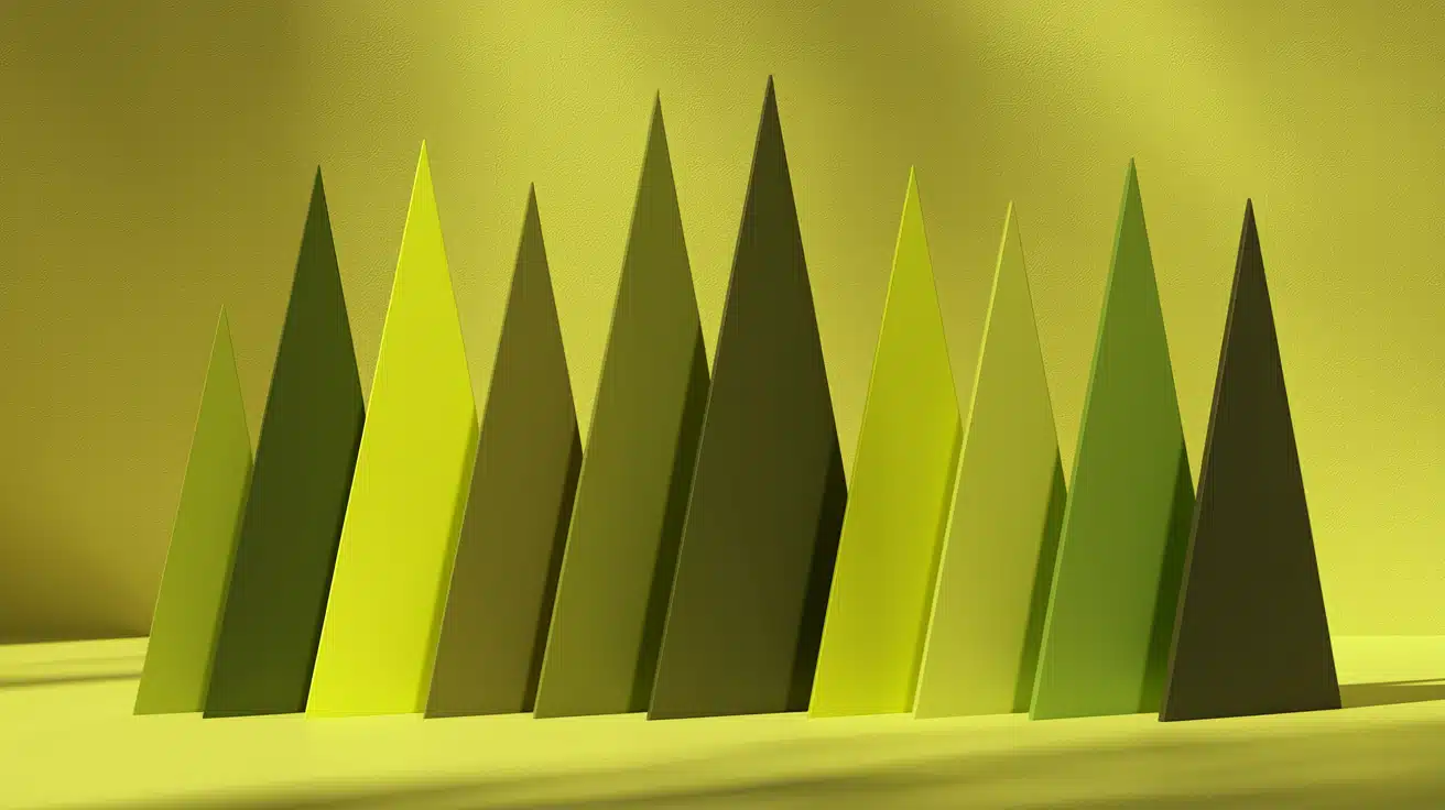
The Ugliest Shades of Green
Green symbolizes nature and calm, but not all shades are appealing. Dull army green or neon greens can be off-putting, depending on the tone and context.
This section examines unattractive shades, ranging from olive to neon, and explores why they are unappealing and their common areas of application. Many of these are regulars on ‘worst color’ lists for décor and fashion.
1. Barf Green
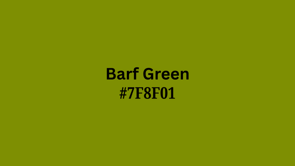
This shade’s reputation is all in its name: “Barf Green.” It’s the kind of murky yellow-green you would connect with stomach-churning stories or a really rough boat ride.
Its name comes from online color lists and cultural jokes, where users described the most disgusting “green” they could think of, and “barf” was what everyone thought of.
Artists, designers, and decorators all stay away from this shade because of its harsh, sickly energy and how it looks like things you don’t want to see.
Even though it’s gross, Barf Green’s bad reputation has led to it showing up in memes and color discussion lists, giving it a reluctant fame of its own.
| Shade | Hex Code | CMYK Color Code (%) | RGB Color Code |
|---|---|---|---|
| Barf Green | #7F8F01 | 11%, 0%, 99%, 44% | 127, 143, 1 |
Fun Fact: This color is so hated that paint stores report zero sales when they accidentally mix it by mistake!
2. Puke Green
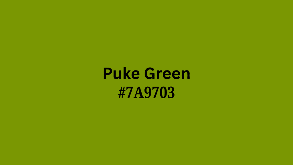
Similar to its barf-producing cousin, “Puke Green” sits at the meeting point of green, yellow, and brown.
The name became popular in pop culture and color naming websites, with people agreeing it looked like the color of being sick.
The connection with bodily fluids means few designers would dare use it unless they want to make things look gross on purpose for humor or effect.
Its special status is being used as shorthand in conversation for anything unappealing or stomach-turning.
| Shade | Hex Code | CMYK Color Code (%) | RGB Color Code |
|---|---|---|---|
| Puke Green | #7A9703 | 19%, 0%, 98%, 41% | 122, 151, 3 |
3. Humorous Green
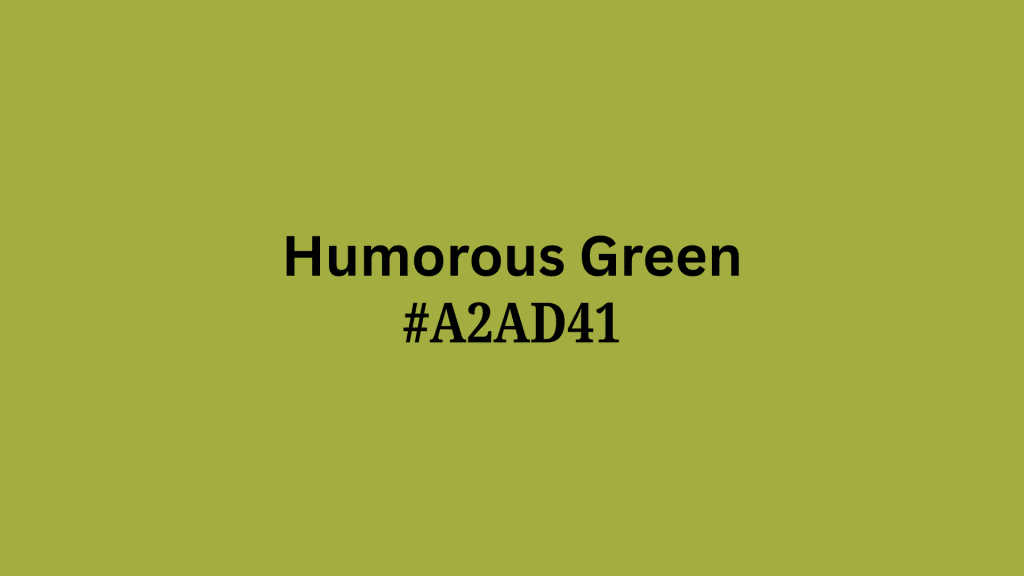
Despite the name, this is not a cheerful color. Its roots are in classic color theory, where yellow-greens were connected with bile, illness, and decay.
Designers often mention this shade as unflattering to skin tones, clothing, and nearly every type of product packaging except maybe compost bins.
Ironically, the color continues more as a warning than a recommendation, highlighting how theoretical approaches to color can differ from real, visual reactions.
| Shade | Hex Code | CMYK Color Code (%) | RGB Color Code |
|---|---|---|---|
| Humorous Green | #A2AD41 | 6%, 0%, 62%, 32% | 162, 173, 65 |
4. Caca D’Oie
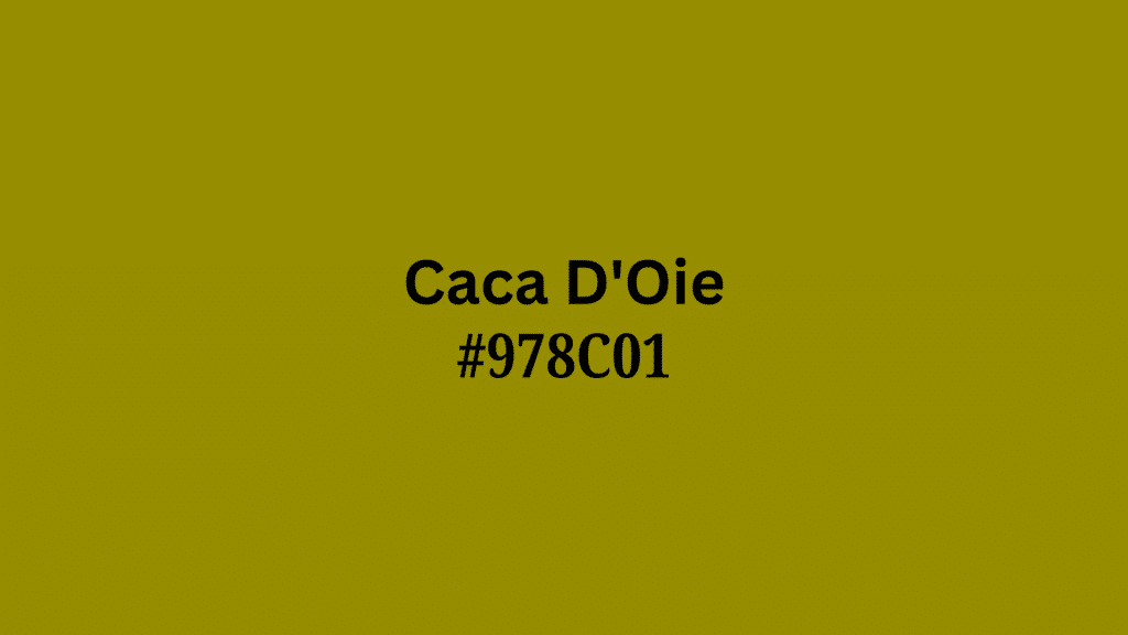
Literally meaning “goose poo” in French, Caca D’Oie’s reputation speaks for itself. Used as a term in 18th and 19th-century French decorative arts, it was both a joking reference and a real attempt to describe a particular kind of yellow-green muddiness.
Its main reputation comes from its name and how it looks like the unappetizing, natural output of barnyard geese.
Despite its historical use, today it’s mostly brought up with a raised eyebrow or a wrinkled nose in design circles.
| Shade | Hex Code | CMYK Color Code (%) | RGB Color Code |
|---|---|---|---|
| Caca D’Oie | #978C01 | 0%, 7%, 99%, 41% | 139, 137, 40 |
Fun Fact: French artists actually wrote this color name in fancy art books and kept straight faces while doing it!
5. Goose Turd Green
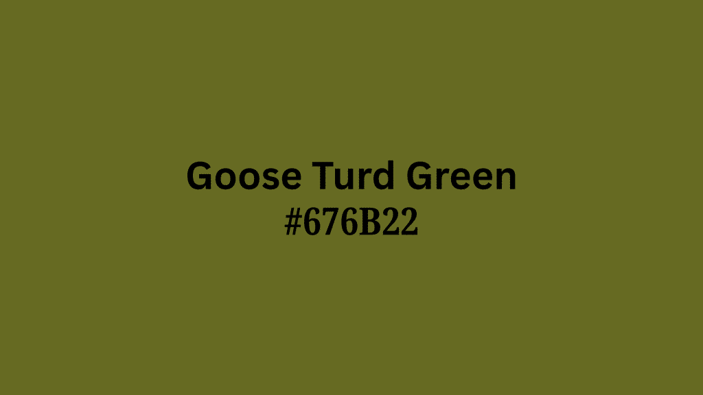
Picture scanning a farm full of geese and then being asked, “What color do you see?” The answer, unfortunately, might be this infamous shade.
“Goose Turd Green” earned its unfortunate name in both English and French decorating traditions, referring to a dull, droopy, slightly brownish-green.
Known for draining life out of interiors and giving skin an unhealthy cast in fashion, the color is mainly mentioned as a what-not-to-do for color combinations.
| Shade | Hex Code | CMYK Color Code (%) | RGB Color Code |
|---|---|---|---|
| Goose Turd Green | #676B22 | 4%, 0%, 68%, 58% | 103, 107, 34 |
6. Chartreuse
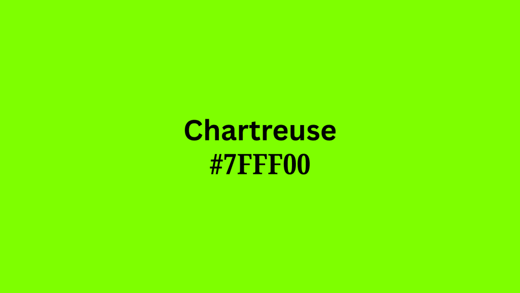
Chartreuse (named after the vivid green French liqueur) has always divided the public.
While some people love its eye-searing brightness and zesty kick, surveys consistently show it’s among the most disliked greens, especially in contexts like cars, clothing, or home décor.
Its almost fluorescent, yellow-tinted punch is famously hard to pair and often leads to descriptions like “highlighter spill” or “radioactive salad,” cementing its place near the top of ugly color lists.
| Shade | Hex Code | CMYK Color Code (%) | RGB Color Code |
|---|---|---|---|
| Chartreuse | #7FFF00 | 50%, 0%, 100%, 0% | 127, 255, 0 |
Fun Fact: The monks who invented Chartreuse liqueur keep their recipe so secret that only two people in the world know it!
7. Sick Green
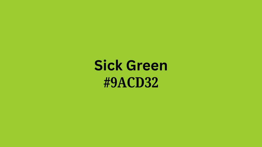
Sick Green’s story is an obvious one: it instantly makes you think of queasy cartoons, germs on microscope slides, or science fiction slime.
As a named color, it appears frequently on digital art sites and in comedic design guides, always as the punchline for “grossest green.”
Its popularity as an “ugly” green is boosted by how unflattering it is on walls and clothes and its subconscious link to illness in the human mind.
| Shade | Hex Code | CMYK Color Code (%) | RGB Color Code |
|---|---|---|---|
| Sick Green | #9ACD32 | 25%, 0%, 76%, 20% | 154, 205, 50 |
8. Nasty Green
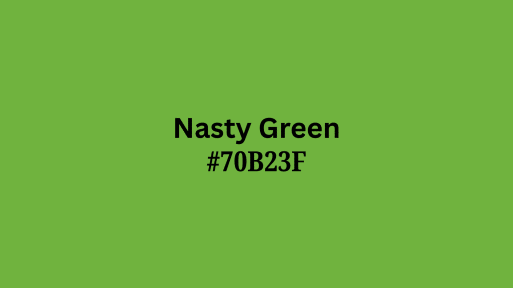
“Nasty Green” frequently tops online lists of worst colors ever made. It surfaces in color dictionaries, home design “what not to paint” charts, and on web forums where users try to one-up each other’s grossest shades.
Its tangy, almost acidic undertones clash with most other colors, and it often makes food, spaces, and even digital graphics look unappealing. Nasty, indeed.
| Shade | Hex Code | CMYK Color Code (%) | RGB Color Code |
|---|---|---|---|
| Nasty Green | #70B23F | 37%, 0%, 65%, 30% | 112, 178, 63 |
9. Olive Drab
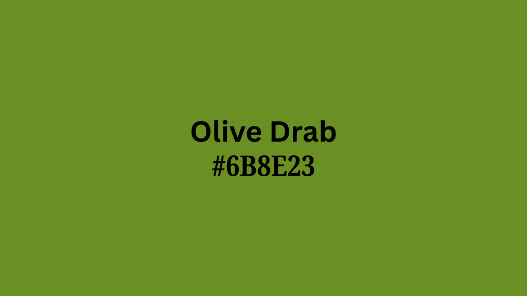
Olive drab’s origins are military, where its blend-into-the-background dullness was desirable for camouflage but not for design appeal.
Over decades, it’s become a synonym for blandness and institutional drabness in everything from uniforms to government buildings.
It rarely flatters complexions or home décor and often appears on “ugly” color lists for its utilitarian, uninspired effect. No surprise, its very name means “dull” or “dirty.”
| Shade | Hex Code | CMYK Color Code (%) | RGB Color Code |
|---|---|---|---|
| Olive Drab | #6B8E23 | 25%, 0%, 75%, 44% | 107, 142, 35 |
Fun Fact: This color was so boring that soldiers in World War II nicknamed their uniforms “pickle suits”!
10. Mud Green
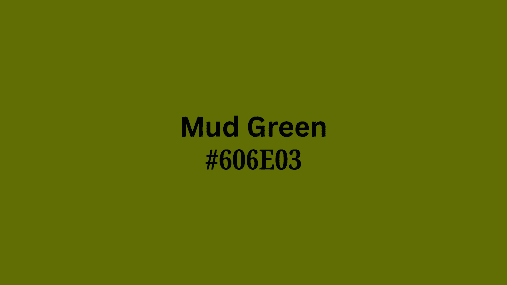
“Mud Green” looks exactly like it sounds: swampy, dark, and a favorite on “ugly paint color” lists. Its origins are natural (swamp mud, mossy ponds, and anything described as “boggy”).
However, while it fits in a forest floor, it saps energy when used in clothing or interiors. It’s connected with neglect, disrepair, or things better left untouched, making it a color rarely chosen on purpose.
| Shade | Hex Code | CMYK Color Code (%) | RGB Color Code |
|---|---|---|---|
| Mud Green | #606E03 | 13%, 0%, 97%, 57% | 96, 110, 3 |
11. Pea Soup Green
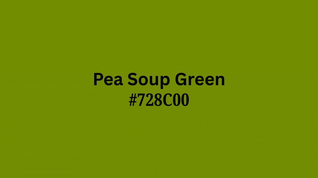
The phrase “pea soup” itself is divisive, thanks to the thick, oily appearance of old-fashioned split pea soup.
The color blends yellow, green, and brown into a shade that’s as unappetizing in décor as it is on a plate.
This pigment became common in 1970s appliances, and subsequently became shorthand for design choices “best left in the past.” Almost every “ugly color” blog calls it out by name!
| Shade | Hex Code | CMYK Color Code (%) | RGB Color Code |
|---|---|---|---|
| Pea Soup Green | #728C00 | 19%, 0%, 100%, 45% | 114, 140, 0 |
Fun Fact: In London, thick fog used to be called “pea soup” because it was this exact gross color!
12. Avocado Green
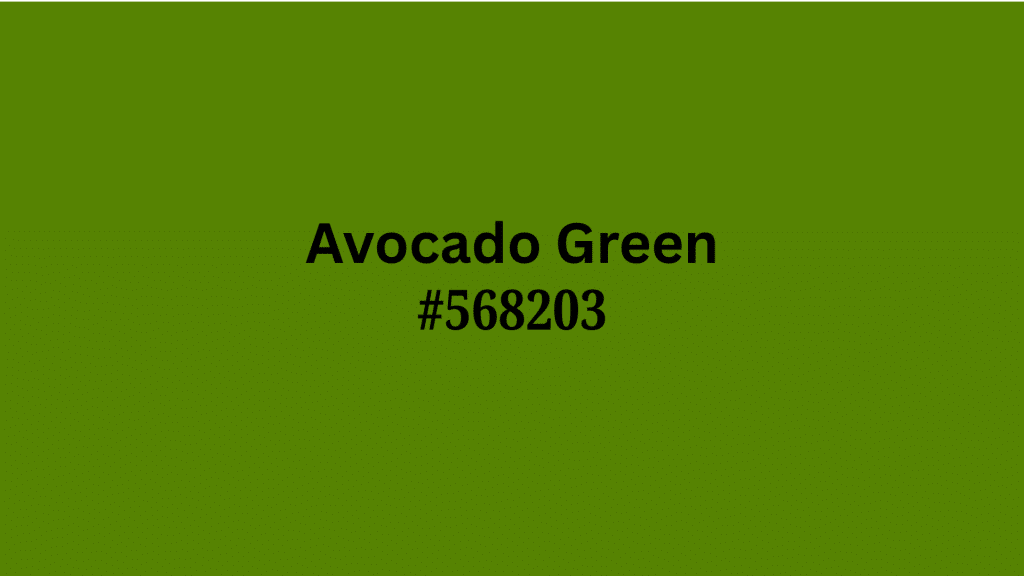
Another relic of the 1960s and ’70s, Avocado Green utterly dominated kitchen appliances and bathroom tiles, only to become a synonym for outdated and unfortunate style.
While the fruit itself is beloved, the color (particularly when used everywhere) makes spaces feel drab.
Its “retro” charm is now mostly brought up in jokes about dated homes and in cautionary lists from interior designers.
| Shade | Hex Code | CMYK Color Code (%) | RGB Color Code |
|---|---|---|---|
| Avocado Green | #568203 | 34%, 0%, 98%, 49% | 86, 130, 3 |
Fun Fact: Avocado green appliances were so popular in the 1970s that some people still have harvest gold and avocado kitchens today!
13. Drab Green
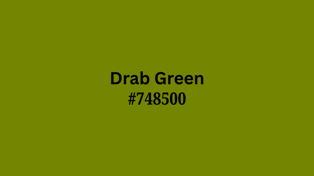
“Drab Green” is both descriptive and judgmental; “drab” means dull, lifeless, and without appeal. The term comes from early military uniforms and utilitarian clothing, where bright colors weren’t practical.
But in daily life, drab green often makes spaces feel cold or institutional, hence its spot on countless “colors to avoid” surveys.
| Shade | Hex Code | CMYK Color Code (%) | RGB Color Code |
|---|---|---|---|
| Drab Green | #748500 | 13%, 0%, 100%, 48% | 116, 133, 0 |
14. Moss Green
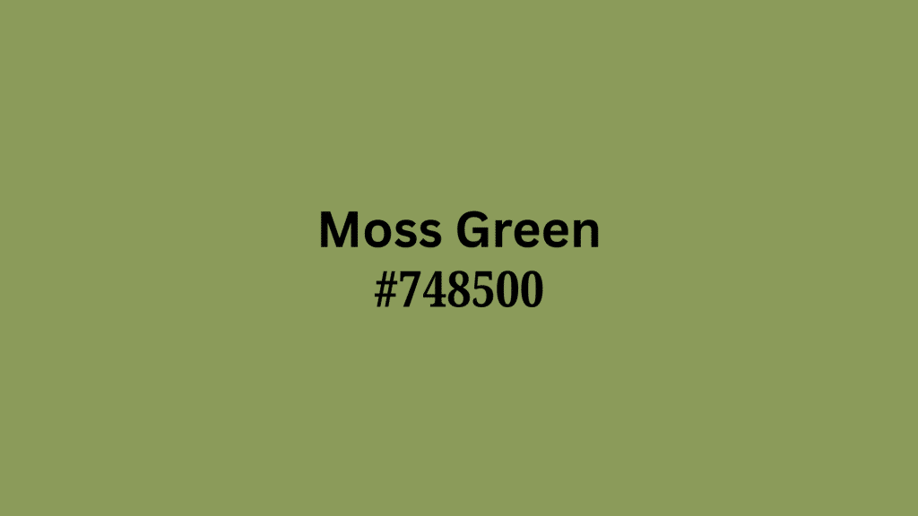
While some forms can be peaceful, the most extreme versions of mossy green are musty and old-looking, especially in poorly lit spaces.
The color’s name comes from how it looks like damp, spongy forest moss and has long been used in descriptions for mold or rot. In design, it’s mentioned as a warning: too much can turn cozy to clammy, and fresh to funeral-like.
| Shade | Hex Code | CMYK Color Code (%) | RGB Color Code |
|---|---|---|---|
| Moss Green | #748500 | 10%, 0%, 41%, 40% | 116, 133, 0 |
15. Yellow-Green
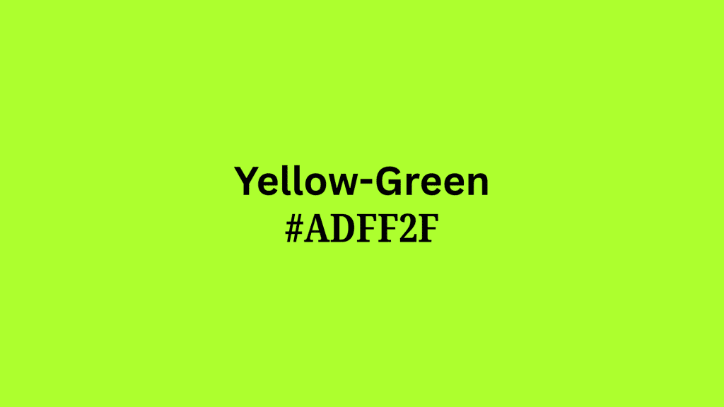
Yellow-Green, whether on cars or clothes, divides opinion but consistently ranks in surveys and blog lists as one of the least liked colors in either fashion or interiors.
Its vibrant, almost neon hue reminds many of highlighter ink or chemical warning signs, making it hard on the eyes and challenging to use tastefully.
Despite its energy, most people connect yellow-green with being garish or out of place.
| Shade | Hex Code | CMYK Color Code (%) | RGB Color Code |
|---|---|---|---|
| Yellow-Green | #ADFF2F | 32, 0, 80, 0 | 173, 255, 47 |
Fun Fact: Tennis balls are actually this color because it shows up best on TV, even though most people think they’re just “yellow”!
Can Ugly Green Be Used Effectively?
While some shades of green may be considered “ugly,” they can still serve important roles in design, art, and fashion when used intentionally. These colors often aim to evoke a mood, elicit emotions, or make a bold statement.
Let’s see how these unattractive greens can be effectively incorporated into various spaces and styles.
The Use of Ugly Green in Design
Sometimes the colors we think are “ugly” can actually make our designs more interesting and bold.
- Creating Contrast and Impact: Ugly green shades can add contrast in a design, making other colors stand out. This can be especially effective in graphic design or fashion, where an unexpected pop of color can create visual interest.
- Setting a Mood: In art or interior design, muted or sickly greens can evoke a specific mood, like discomfort or eeriness, or a toxic vibe, which is often used in horror-themed designs or to convey a sense of decay or age.
- Designing for Specific Contexts: Ugly greens, such as army or olive green, can evoke a sense of ruggedness or an industrial feel, making them suitable for designs that aim for a rugged or utilitarian vibe.
How to Incorporate Ugly Green in Your Home or Wardrobe
Ready to try ugly green but not sure where to start? Here are some easy ways to add it to your space and style.
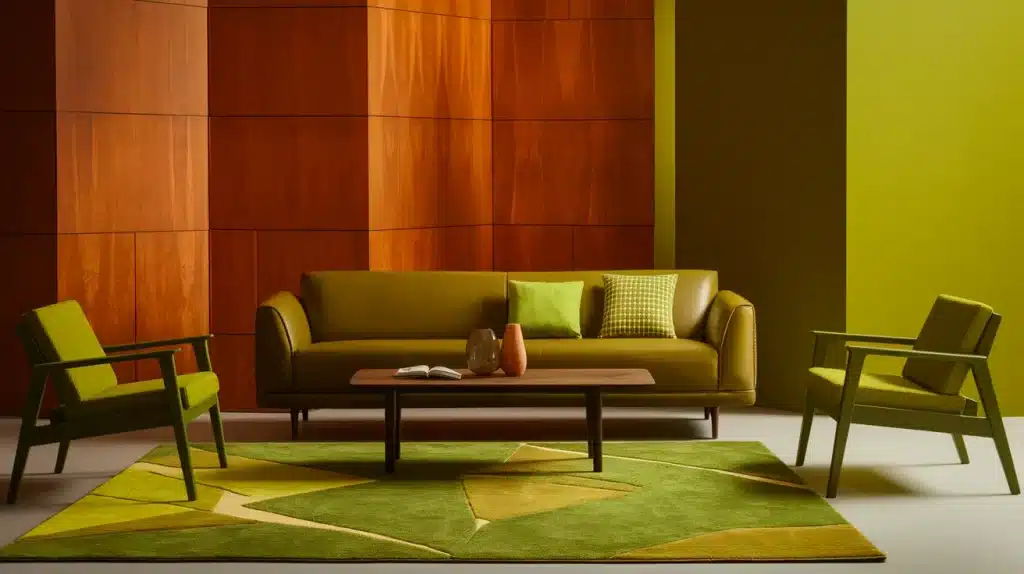
- Accent Pieces in Interior Design: Use ugly green as an accent color in small doses, such as in throw pillows, rugs, or wall art, to add depth without overwhelming the space.
- Pairing with Neutrals: In fashion, balance out ugly greens by pairing them with neutral tones like black, gray, or beige. This helps tone down the harshness of the color, creating a more cohesive look.
- Strategic Wall Colors: In home décor, use muted greens like olive or sickly green on one wall or in smaller rooms, such as a study or hallway, to create a statement without dominating the entire room.
- Layering with Textures: In fashion, combine unflattering greens with contrasting textures, such as leather, denim, or wool, to enhance the visual appeal and make the color feel less harsh.
Conclusion
This post examines unappealing green shades, such as olive and neon, which evoke negative feelings associated with discomfort, decay, or aggression.
While these hues are often considered among the ugly colors spectrum, they shouldn’t be completely dismissed.
Although these colors may not always be universally loved and frequently appear on ugliest colors lists, they can be used effectively in art, design, or fashion to make bold statements or set a mood.
Ultimately, your choice to choose or avoid these shades depends on personal taste and the environment in which they’re used.
What do you think? Which shades of green do you find the most unappealing?
Share your thoughts in the comments below, and be sure to check out our related articles on color trends and design tips for more information on how to incorporate color into your space and wardrobe.