

Some colors look awesome together! Like when you see a bright orange sunset against a deep blue sky, or red apples on a green tree?
These aren’t accidents – they’re color opposites that make each other pop! Colors have best friends that sit right across from them on the color wheel.
Orange and blue go hand in hand, and if you’ve ever wondered what is the opposite of red, it’s actually green! And just like that, the opposite of blue is that warm, inviting orange.
These special color pairs are called complementary colors, and they’re everywhere around us.
Once you learn this color secret, you’ll start seeing these magical combinations in movies, art, sports teams, and even your own closet. Get ready to learn why opposite colors are actually the best of friends!
What Is the Opposite of Orange?
Ever wonder what color is the total opposite of orange? It’s blue! Think of a color wheel as a large circle with all the colors arranged in sequence.
Colors that sit directly across from each other are called “complementary colors” – they’re like color opposites that create the strongest contrast when put together.
Orange and blue are perfect examples of this. That’s why you see this combo everywhere – from movie posters to sports team uniforms to sunset photos where the orange sun pops against a blue sky.
Designers often pair orange and blue to make things stand out, as these complementary colors enhance each other’s brightness and excitement.
How Does the Concept of Color Opposites Apply in Art?

Color opposites, called complementary colors, are like best friends who look excellent together!
When artists put orange and blue next to each other, something magical happens – both colors become brighter and more exciting. It’s like they’re showing off for each other!
Artists often use this technique to make their paintings stand out from the canvas.
You can see this in famous sunset paintings where bright orange skies meet deep blue water, or in Van Gogh’s “Starry Night” where golden stars dance against a swirling blue sky.
Try this yourself: paint an orange flower with blue shadows, or draw a blue ocean with an orange sunset. The contrast will bring your artwork to life and capture everyone’s attention!
How Different Color Systems Change What’s Opposite
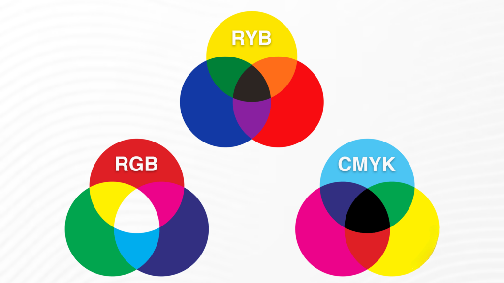
Did you know that the “opposite” of a color can change depending on its context? It’s true!
When designing for a computer screen, you typically use RGB colors (Red, Green, Blue). For printing on paper, you use CMYK colors (Cyan, Magenta, Yellow, Black).
And in art class, you probably learned about RYB colors (red, yellow, blue).
Here’s where it gets interesting: green’s opposite is red in art class, but it appears as bright pink on your computer screen. That’s because each system mixes colors differently.
RGB adds light to make colors brighter, while CMYK subtracts light. It’s like having three different sets of rules for the same game!
Don’t worry, though – for most of your creative projects, these differences won’t matter much.
Color Opposites in Art: The Magic of Orange and Blue
Artists have a secret weapon for making their artwork stand out: they use complementary colors. Orange and blue are like best friends who are different but complement each other, making each shine brighter.
| Where You See It | What Artists Do | Why It Works |
|---|---|---|
| Sunset Paintings | Orange sun + deep blue sky | Makes the sunset look like it’s glowing |
| Shadow Tricks | Blue shadows + orange objects | Makes things look 3D and real |
| Famous Art | Van Gogh’s “Starry Night” | Creates that magical, dreamy feeling |
| Movie Posters | Orange explosions + blue backgrounds | Grabs your attention from across the room |
This color combo works like magic because our eyes love opposites, just like how a campfire looks extra cozy against a night sky!
Note: Once you notice orange and blue together, you’ll see it everywhere – in movies, art, and even video games!
Practical Applications of Complementary Colors
Want to make your art pop? Use orange and blue together!
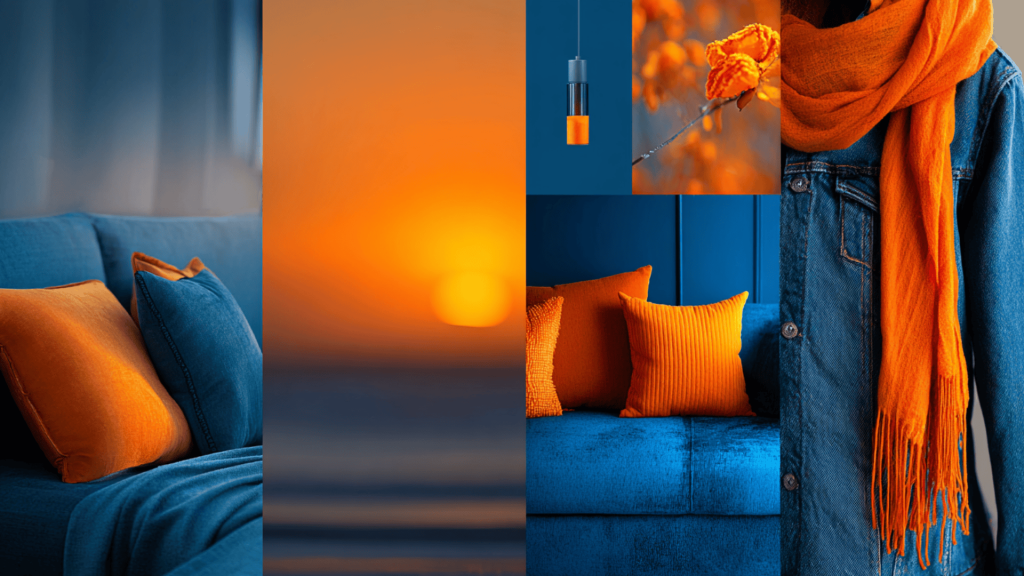
These opposite colors create an excellent contrast that catches the eye instantly. In photography, try capturing a bright orange sunset against a deep blue sky.
For fashion, pair a blue denim jacket with an orange scarf for a trendy look. In your bedroom, add orange throw pillows to a blue couch for an instant style boost.
Artists use this color combo to make paintings more exciting and dramatic. When you put complementary colors side by side, they make each other look brighter and more vibrant. It’s like magic for your eyes!
Easy Tricks to Spot Any Color’s Best Friend
Want to become a color detective? Finding the opposite color is easier than you think!
Picture a color wheel like a pizza cut into six slices. Each slice has a different color: red, orange, yellow, green, blue, and purple.
To find opposites, simply draw a straight line across the circle. Whatever colors the line touches are best friends!
Here’s your cheat sheet: Blue loves orange, red adores green, and yellow can’t live without purple. It’s that simple!
Try this fun game: look around your room and spot these color pairs. You’ll be amazed how often designers use this trick.
Once you know the secret, you’ll see these magical combinations everywhere – from your favorite movie posters to the clothes in your closet!
Complementary Colors: Making Your Photos and Designs Pop!
Understanding complementary colors like blue and orange can make your creative work stand out as unique and eye-catching.
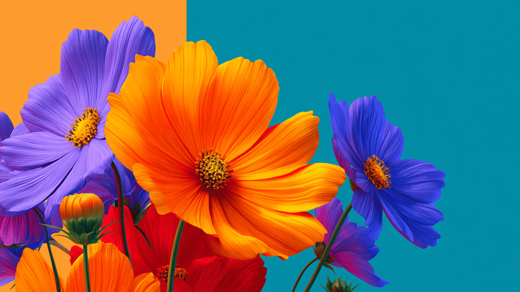
- Blue and Orange Make Photos Pop – Photographers love using blue skies with orange subjects, such as flowers, buildings, or people wearing warm clothes.
- Green and Red Create Drama – Many photographers use green backgrounds with red objects to create eye-catching images.
- Purple and Yellow – for Sunny Moods. Purple flowers with yellow centers or yellow objects against a purple background create a cheerful, energetic feeling.
- Graphic Designers Use Color Tricks – Website designers often use complementary colors for buttons to grab attention.
- Fashion Uses Opposite Colors – Fashion designers create stunning outfits by mixing complementary colors in clothing.
Color Magic Made Simple. Next time you take photos or decorate your room, remember that opposite colors are best friends that make each other shine brighter!
Summing It Up
Now you know the secret that artists and designers have used for centuries – complementary colors are like magic!
Orange and blue, red and green, purple and yellow – these opposite colors make each other shine brighter and look more exciting.
The next time you see a beautiful sunset, take a moment to notice how the orange sun makes the blue sky look even more wonderful.
Or check out movie posters at the theater – you’ll spot these color tricks everywhere!
If you’re painting, taking photos, or simply selecting clothes, remember that opposite colors are best friends. They help each other look their absolute best!
What’s your favorite color combination? Tell us in the comments below which complementary colors you love most!