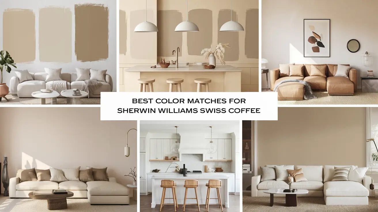
When it comes to white paint colors, Swiss Coffee has become a go-to choice for many.
Its gentle warmth and versatility make it a favorite for walls, trim, and cabinets alike.
While everyone loves this shade, finding the right colors to pair with it can be challenging.
The good news is that creating beautiful color combinations with Swiss Coffee doesn’t have to be complicated.
The right pairings can bring out its subtle warmth while creating a balanced look in any room.
This guide will walk you through five perfect Sherwin-Williams color matches for Swiss Coffee, complete with real-world examples and room-by-room suggestions.
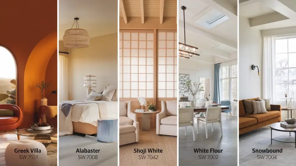
Top Color Matches for Swiss Coffee
Let’s explore five Sherwin-Williams colors that work wonderfully with Swiss Coffee. Each shade brings unique qualities that can help create your perfect space.
1. Greek Villa SW 7551
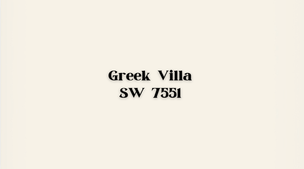
- Description: Greek Villa is a smooth, creamy white with soft beige undertones. Its warm yet neutral appearance can seamlessly complement various modern and traditional styles.
- Best Usage: This versatile color is perfect for living rooms, kitchens, and exteriors. It works beautifully as a wall color, cabinet shade, or even for the exterior of your home, providing a timeless, inviting look.
- Similar to: Greek Villa resembles Swiss Coffee from other brands like Behr or Benjamin Moore, offering a creamy, warm white tone without being too yellow or buttery.
2. Alabaster SW 7008

- Description: Alabaster is a soft white with neutral undertones, making it a versatile color for almost any space. Its understated warmth gives it a welcoming feel, but it also maintains a fresh, clean look.
- Best Usage: Alabaster is widely used for trim, walls, and cabinets. Its subtle warmth makes it ideal for creating a cozy, inviting atmosphere without overwhelming the space. It’s especially popular in modern homes.
- Similar to Swiss Coffee from Benjamin Moore, alabaster is a soft white with a slightly warmer tone that complements a variety of design styles.
3. Shoji White SW 7042
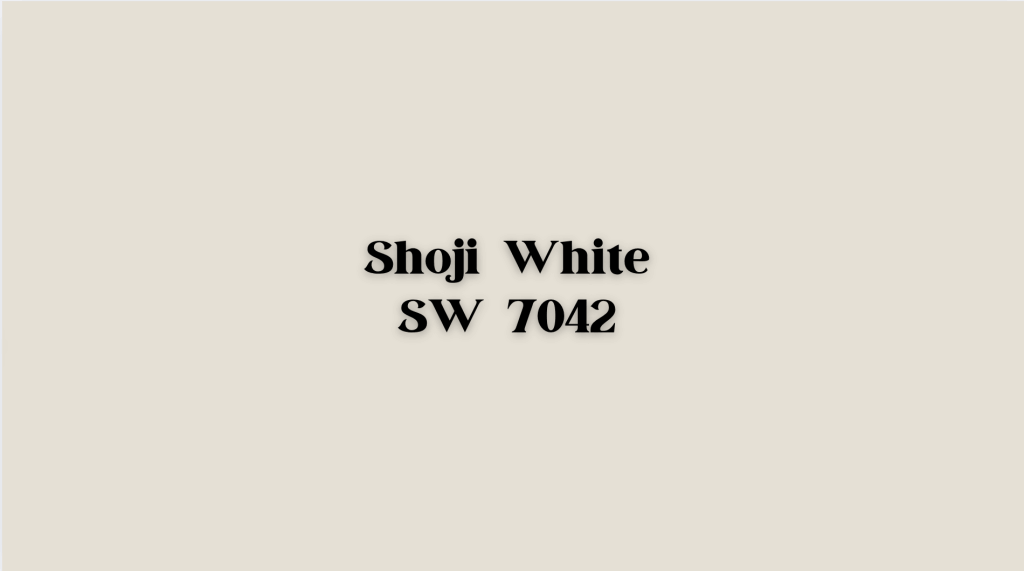
- Description: Shoji White is a creamy white with subtle vanilla-bean undertones, giving it a rich, soft feel. It’s slightly deeper than many other whites, creating a cozy yet refined atmosphere.
- Best Usage: This color is perfect for living rooms or bedrooms where you want to add warmth and comfort without going too dark. Its creamy tone makes it an ideal choice for spaces that require a soft, calming environment.
- Similar to: Shoji White’s creamy tones are similar to Swiss Coffee’s, but it offers a more distinct vanilla warmth. This combination is perfect for creating a cozy, inviting ambiance in your home.
4. White Flour SW 7102
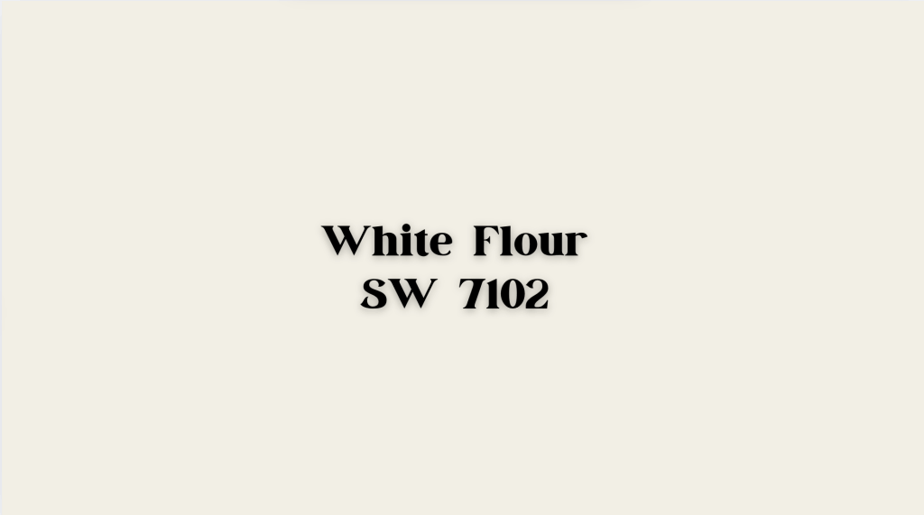
- Description: White Flour is a very light, neutral off-white with just a touch of beige warmth. Its pale hue makes it feel fresh and open while maintaining a soft, welcoming quality.
- Best Usage: This color works best in larger spaces or open-plan designs. It helps create a sense of openness and light, making it ideal for expansive rooms or modern homes that embrace minimalist design.
- Similar to: White Flour is a light alternative to Swiss Coffee. It has a similar neutral base but a slightly lighter, more airy feel, making it perfect for open spaces.
5. Snowbound SW 7004

- Description: Snowbound is a clean white with a hint of pink, which gives it a soft, warmer effect compared to pure whites. This subtle warmth can add depth and interest to a room without being overpowering.
- Best Usage: Snowbound works wonderfully as a trim color or for subtle accents in bright spaces. It’s ideal for creating a gentle contrast against darker hues and works especially well in modern or transitional designs.
- Similar to: Snowbound is a milder match to Swiss Coffee, with a slightly warmer and pinker undertone. It offers a softer, more delicate look than other Swiss Coffee-inspired whites.
LRV Comparison of Each Colour
How LRV Affects The Feel of a Space
- Higher LRV (e.g., White Flour): Colors with a higher LRV reflect more light, making rooms feel larger and more open. These are great for small spaces or rooms with limited natural light.
- Lower LRV (e.g., Shoji White): Colors with a lower LRV absorb more light, making a room feel more intimate and cozy. These are ideal for larger spaces or rooms with lots of natural light that could benefit from a bit of warmth.
When choosing a color, consider the amount of natural light in the room and the desired ambiance. Lighter shades (higher LRV) work well for bright, airy spaces, while darker shades (lower LRV) are perfect for creating a cozy, intimate atmosphere.
LRV Breakdown for Each Color Match
| Color Name | LRV | Description |
|---|---|---|
| Greek Villa SW 7551 | 84 | Reflects a moderate amount of light, creating a warm and inviting space without feeling too bright or too dark. Ideal for balanced light and warmth. |
| Alabaster SW 7008 | 82 | It reflects slightly less light than the Greek Villa, offering a soft, warm effect. Works well in both well-lit and dim rooms. |
| Shoji White SW 7042 | 74 | It absorbs more light, giving a rich, creamy feel. Best for well-lit spaces that need a soothing, deeper vibe. |
| White Flour SW 7102 | 87 | The brightest and most reflective, ideal for larger or darker rooms to maximize light and create an open, airy feel. |
| Snowbound SW 7004 | 83 | Reflects a good amount of light, giving a crisp, fresh feel. Great for trims or accent walls, brightening spaces with minimal natural light. |
Choosing the Best Match Based on Your Room’s Needs
When picking the right color, it’s important to think about how you want your space to feel. Different colors bring different vibes to a room. Here’s how to choose the best match based on your room’s needs:
-
For Warmth: Shoji White or Greek Villa are great options if you’re looking for a cozy, inviting feel. Both have warm undertones that create a comforting atmosphere, perfect for living rooms or bedrooms.
-
For Brightness: White Flour or Alabaster are the best choices if you want to make a room feel more open and airy. These colors reflect light well, brightening up the space and making it feel fresh and spacious.
-
For Trims: Snowbound or White Flour works wonderfully when choosing a color for trims. Both are light and neutral, providing a clean, crisp look that highlights the details in your room. Snowbound has a soft, warm feel, while White Flour adds a bit of brightness.
These colors will help you make the right choice by helping you consider the mood you want to create in each room.
Sherwin Williams Colors Similar to Swiss Coffee
Here are a few more Sherwin Williams colors that closely match Swiss Coffee, each offering unique qualities:
1. Sanctuary SW 9671 – Slightly Darker, Soothing Tone
Sanctuary is a deeper, calming color perfect for cozy spaces like bedrooms. Its warm undertones provide a soothing, intimate atmosphere.
Best For: Bedrooms and relaxing spaces.
2. Westhighland White SW 7566 – Brighter with a Higher LRV
Westhighland White is similar to Swiss Coffee but brighter due to its higher LRV. A warm undertone complements its fresh, airy feel.
Best For: Small rooms and trim.
3. Shell White SW 8917 – Soft and Welcoming
Shell White is a creamy, warm color that mirrors Swiss Coffee’s inviting feel. Its versatility makes it perfect for living rooms and kitchens.
Best For: Living rooms, kitchens, and welcoming spaces.
Conclusion
Finding the right Swiss Coffee match doesn’t have to be complicated.
Each Sherwin Williams alternative we’ve explored has its special qualities, from Greek Villa’s versatile warmth to Snowbound’s subtle pink undertones.
These shades prove that creamy whites can fit any space while maintaining their unique character.
Whether you choose the popular Alabaster for its flexibility, Shoji White for its cozy feel, or White Flour for its bright balance, you get more than just a color match.
You’re selecting a shade that can grow with your space and adapt to your style choices over time.
Remember, lighting plays a key role in how these colors appear.
Take time to test your chosen shade in different parts of your room and at various times.
