

Looking for a green that feels both calm and special? Sherwin-Williams’ Laurel Woods (SW 7749) might be your answer. This green shade sits right in the sweet spot – not too bold, not too quiet.
Unlike many basic greens, Laurel Woods has a unique quality. It changes with the light around it. In daytime, it looks fresh and clear. At night, it becomes warm and cozy.
People who want a touch of nature in their homes love this color. It works well in many rooms and with different styles. Designers often pick Laurel Woods when they want a color that feels both classic and new at the same time.
Sherwin-Williams Laurel Woods Overview
| Attribute | Details |
|---|---|
| Color Name | Laurel Woods |
| SW Color Code | SW 7749 |
| Location Number | 237-C7 |
| LRV (Light Reflectance Value) | 6 |
| RGB Values | 68 / 73 / 61 |
| Hex Value | #44493D |
| Color Family | Green |
| Color Collections | Emerald Designer Edition, Naturals |
| Available In | Interior/Exterior |
| Description | A sophisticated, muted green with gray undertones that evokes the tranquility of forest shadows and woodland serenity |
Psychological Impact of Forest Greens
Forest greens like Laurel Woods tap into our innate connection with nature, creating spaces that feel inherently restorative and balanced. These woodland-inspired hues have profound effects on our psychology:
- Lower stress levels and reduce mental fatigue
- Improve concentration and cognitive performance
- Create a sense of shelter and protection
- Balance activity with tranquility
- Foster feelings of growth, renewal, and vitality
How Laurel Woods Evokes Balance, Serenity, and Timelessness
Laurel Woods occupies a unique position in the color spectrum, blending the vitality of green with the sophistication of gray undertones: As a hue with an LRV of 6, it reads grounded and intimate in most lighting.
Balance: The muted quality of Laurel Woods creates remarkable equilibrium in any space. Neither too stimulating nor too sedate, it provides the perfect background for both quiet contemplation and engaged conversation. Its balance between warm and cool undertones makes it adaptable to various lighting conditions and complementary colors.
Serenity: There’s an inherent tranquility in Laurel Woods that evokes dappled forest light and the peaceful feeling of woodland walks. This subtle green creates spaces that feel like sanctuaries from the outside world—rooms where breathing slows, voices naturally soften, and a sense of calm prevails without feeling forced or contrived.
Timelessness: Unlike trendy greens that can quickly date a space, Laurel Woods possesses a timeless quality that transcends design fads. Its connection to the natural world gives it staying power that more artificial or intense colors lack. The color feels simultaneously classic and current, rooted in tradition yet perfectly suited to contemporary sensibilities.
Ideal for Those Who Value Understated Natural Connection
Laurel Woods appeals to individuals with discerning tastes who appreciate nuance and authenticity:
- The nature enthusiast seeking to bring the outdoors in without literal interpretations
- The minimalist who values quality and depth over quantity and surface appeal
- Professionals who need spaces that support focus and reduce stress
- Those who entertain frequently and want backgrounds that enhance rather than compete with conversation
- Anyone looking to create environments with emotional resonance and visual staying power
This sophisticated green particularly resonates with those who find bright colors too overwhelming and neutrals too predictable. Laurel Woods offers the perfect middle ground—distinctive enough to make a statement yet composed enough for everyday living. It also works well as a paint choice for walls and trim.
Rooms Made Better with Laurel Woods
Living Rooms: Sophisticated Comfort
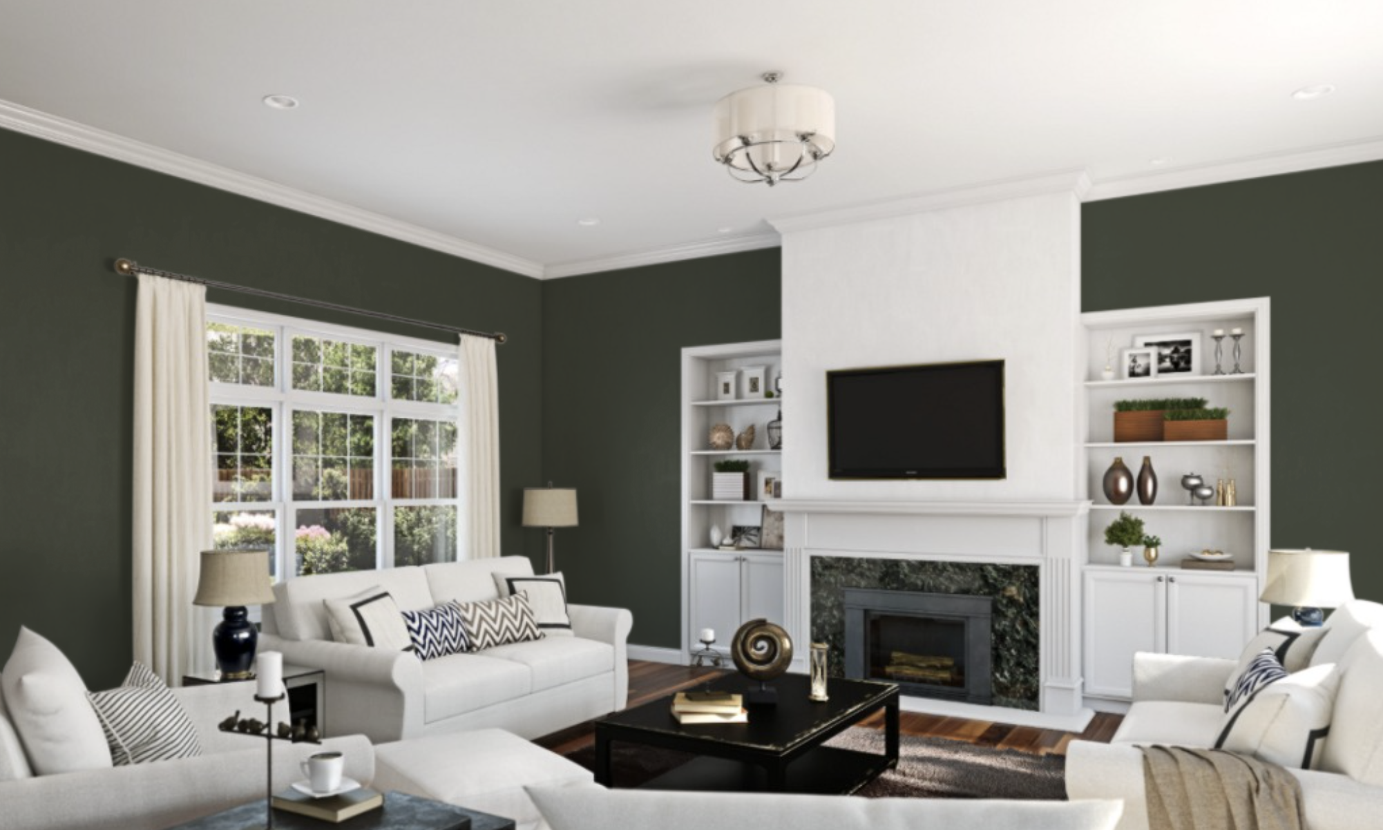
Laurel Woods creates living spaces that balance formality with comfort in a way few other colors can achieve. Its depth provides a sense of gravitas that promotes traditional furniture while its natural undertones keep the atmosphere welcoming rather than stuffy.
When paired with natural textiles like linen, wool, and leather, Laurel Woods living rooms feel simultaneously curated and comfortable.
The color’s subtle shifts throughout the day—more vibrant in morning light, richer and more intimate by evening—create spaces that remain visually interesting over time without relying on bold accents or dramatic contrasts.
Home Offices: Focused Productivity
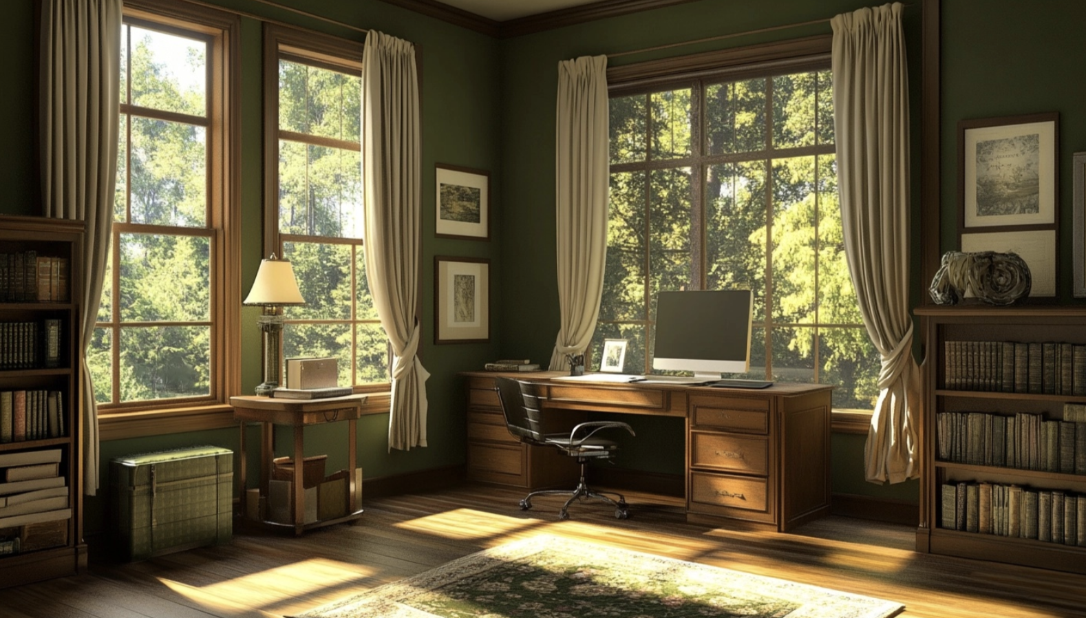
For work environments, Laurel Woods offers the ideal backdrop for sustained concentration and creative thinking. Studies have shown that muted greens improve focus while reducing eye strain during screen-intensive work.
The color’s natural associations promote well-being during long workdays, creating a sense of being supported by nature even in indoor settings.
When used in home offices with warm wood furniture, brass accents, and plenty of natural light, Laurel Woods creates a professional atmosphere that feels distinctly different from corporate environments—more personal, more nurturing, and ultimately more conducive to both productivity and satisfaction.
Bedrooms: Restorative Retreats
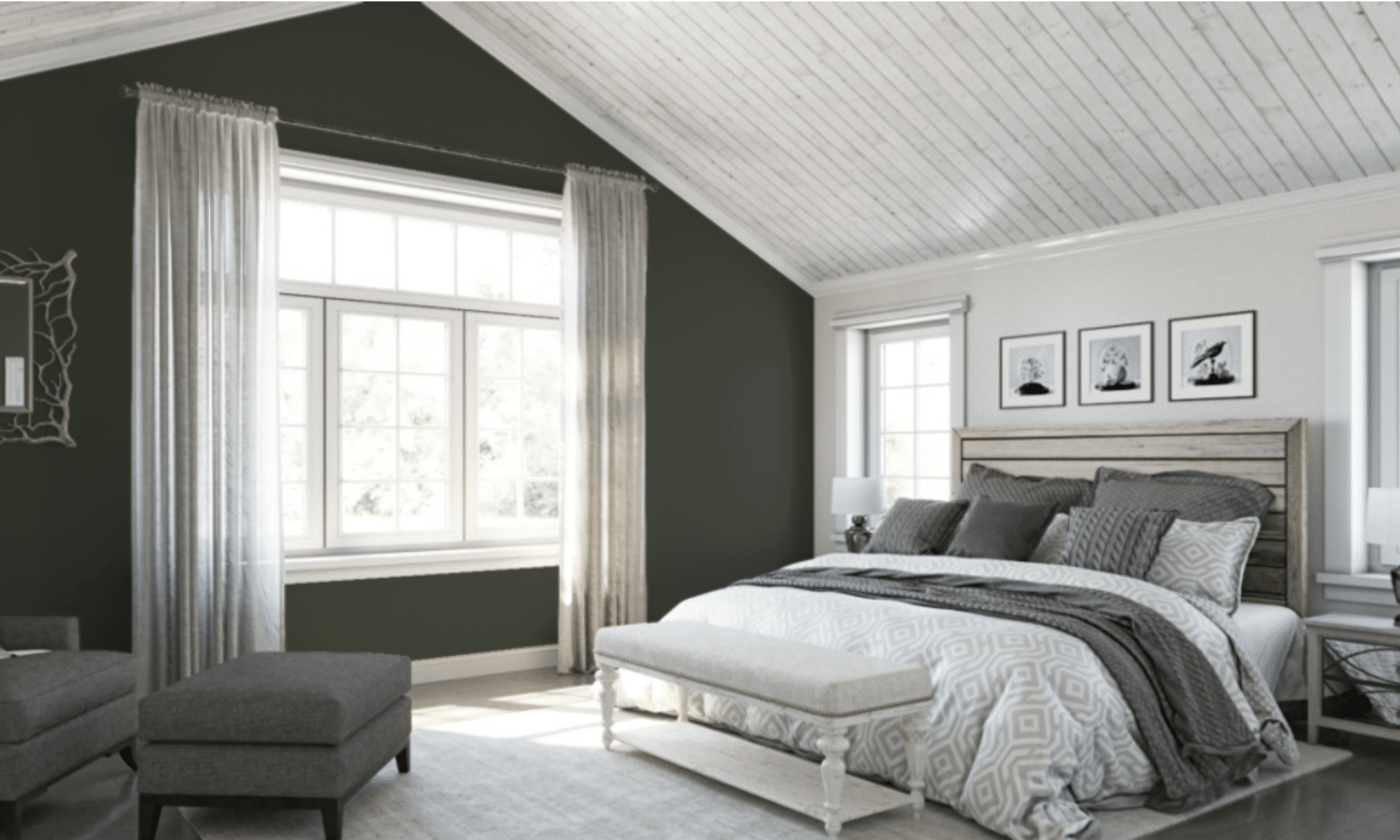
In bedroom settings, Laurel Woods reveals its most calming qualities, creating sleep spaces that genuinely support rest and renewal. The color naturally recedes, creating the perception of expanded space even in smaller rooms, while its depth ensures the room never feels cold or clinical.
Paired with crisp white linens, the combination creates a hotel-like sophistication; with warmer neutrals and natural fibers, the effect becomes more organic and grounding.
Either approach benefits from the color’s proven ability to lower heart rate and reduce stress—physical effects that make Laurel Woods bedrooms not just aesthetically pleasing but functionally superior for quality sleep.
Dining Rooms: Luxury Entertainment
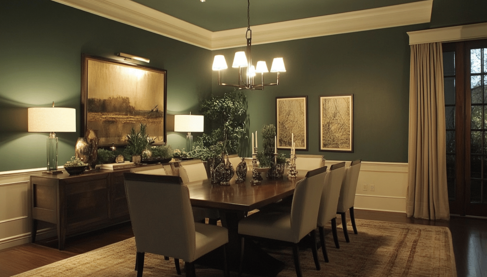
Laurel Woods dining rooms possess a quiet elegance that enhances both casual meals and special occasions. The color creates a sophisticated envelope that makes even simple table settings appear more intentional and refined.
Unlike brighter colors that can compete with food presentation, Laurel Woods provides a complementary background that allows culinary creations to shine.
Its forest associations subtly connect to themes of nourishment and gathering, while its muted quality ensures conversations remain the focus of any dining experience. When paired with warm lighting and reflective surfaces like mirrors or metallic accents, Laurel Woods creates dining spaces with remarkable depth and visual interest.
What Colors Pair Well With Laurel Woods
Complementary Colors
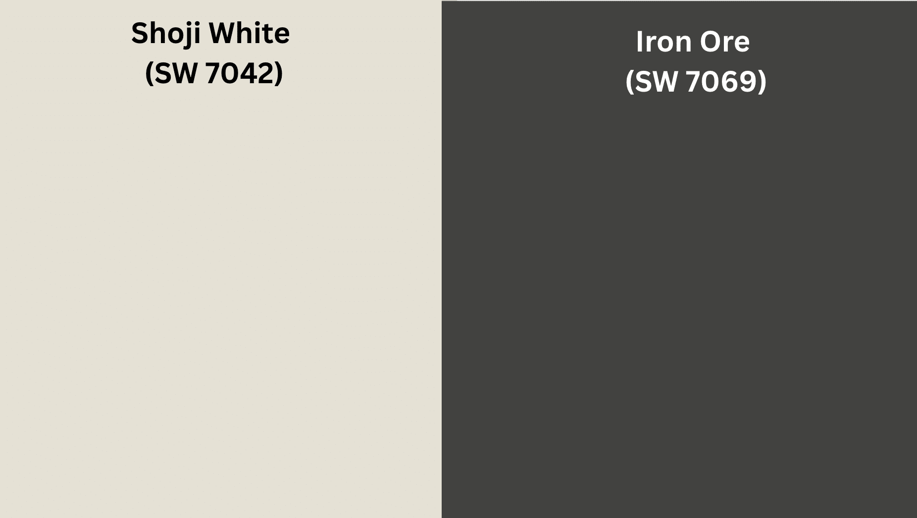
Laurel Woods creates sophisticated harmony when paired with warm whites like Shoji White (SW 7042) or Alabaster (SW 7008). These soft whites provide contrast without harshness, allowing Laurel Woods’ complexity to be fully appreciated while creating visual breathing room. The combination feels balanced and refined rather than stark, especially for trim paint.
Metallic elements in antique bronze or aged brass enhance Laurel Woods’ natural sophistication. These metals echo the warmth in the green’s undertones, creating a relationship that feels organic rather than contrived. This pairing works particularly well for hardware, lighting fixtures, and decorative accessories.
For a more dramatic effect, deep charcoals like Iron Ore (SW 7069) or Tricorn Black (SW 6258) create compelling contrast with Laurel Woods. This combination adds architectural definition and visual weight to spaces, particularly effective for highlighting millwork, window frames, or built-in furniture against Laurel Woods walls.
Contrasts
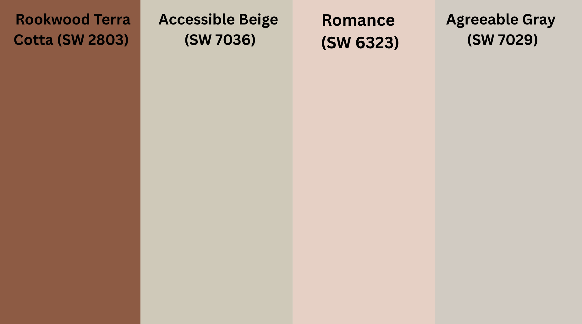
For unexpected yet harmonious contrast, terra cotta tones like Rookwood Terra Cotta (SW 2803) or Cavern Clay (SW 7701) create a sophisticated pairing with Laurel Woods. This combination mirrors relationships found in nature—forest and earth—resulting in spaces that feel grounded and authentic.
Soft blush tones such as Romance (SW 6323) create a surprisingly elegant counterpoint to Laurel Woods’ depth. This pairing feels both current and timeless, adding a touch of warmth and subtle femininity to the green’s more serious character.
Natural linen colors like Accessible Beige (SW 7036) or Agreeable Gray (SW 7029) provide the perfect neutral companion to Laurel Woods. These versatile neutrals create breathing room without competing with the green’s character, allowing for layered, sophisticated spaces that feel cohesive rather than contrived.
Sherwin-Williams Suggestions for Palettes
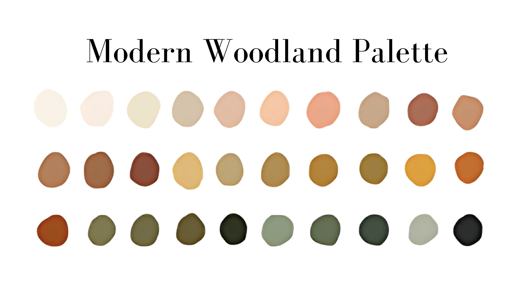
Modern Woodland Palette:
- Laurel Woods (SW 7749) – Main walls
- Pure White (SW 7005) – Trim and ceilings
- Poised Taupe (SW 6039) – Complementary elements
- Urbane Bronze (SW 7048) – Accent details
Sophisticated Heritage Palette:
- Laurel Woods (SW 7749) – Feature walls or millwork
- Greek Villa (SW 7551) – Secondary walls
- Copper Mountain (SW 6356) – Accent color
- Keystone Gray (SW 7504) – Grounding elements
Transitional Palette:
- Laurel Woods (SW 7749) – Main color
- Creamy (SW 7012) – Complementary walls
- Basil (SW 6194) – Coordinating green (lighter)
- Carnelian (SW 7580) – Accent details
Conclusion
Sherwin-Williams’ Laurel Woods shows why colors from nature last longer than short-term fads. This green shade helps make homes feel both stylish and comfortable. In our busy lives, this color gives us a small link to the outdoors, which helps us feel more at ease.
What makes Laurel Woods stand out from other greens is how well it works in many settings. It fits with old and new home styles alike. This color looks good next to smooth stone or rough wood. It makes rooms feel planned but not forced.
Many of us want homes that feel safe and calm. Laurel Woods gives us just that—a color with enough character to notice, but gentle enough to live with every day.
If you want a room that looks good now and for years to come, this green is a smart choice. It shows that the best colors are ones that remind us of nature while making our daily spaces feel special. If you’re choosing from Sherwin Williams, test samples in both daylight and evening to see its range.