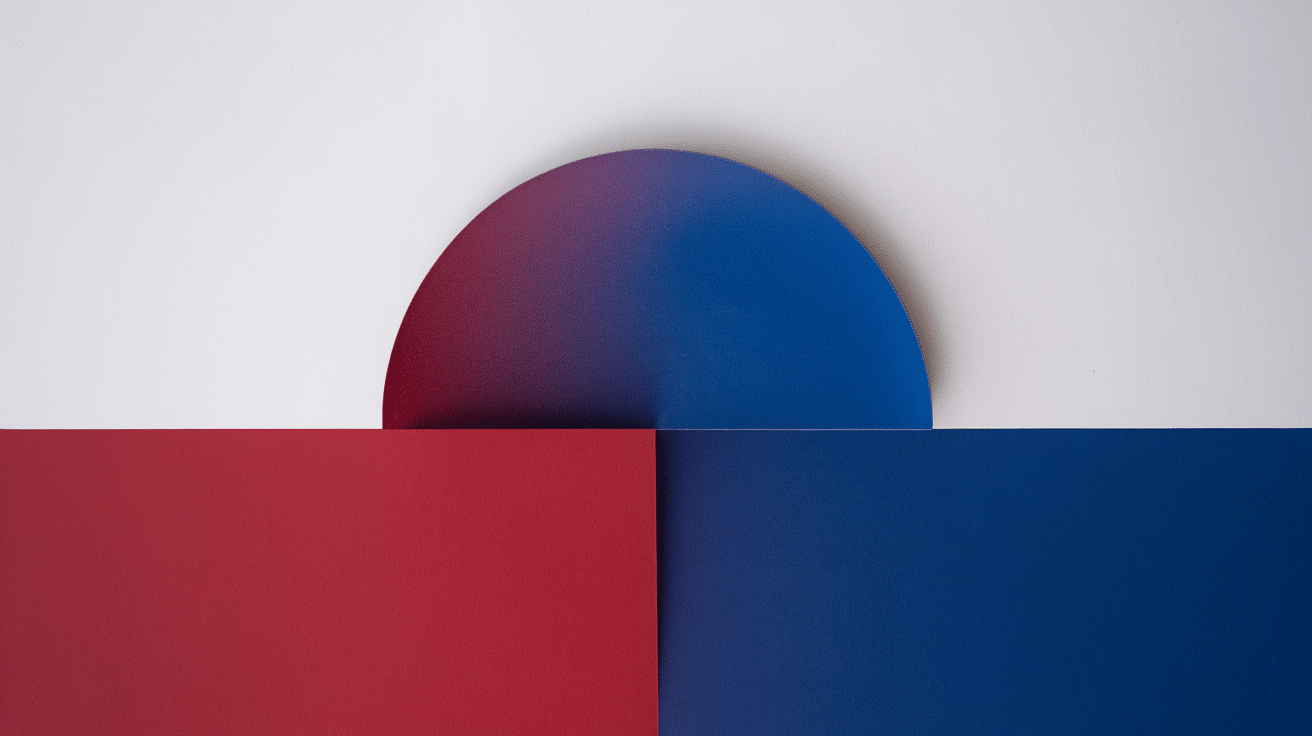

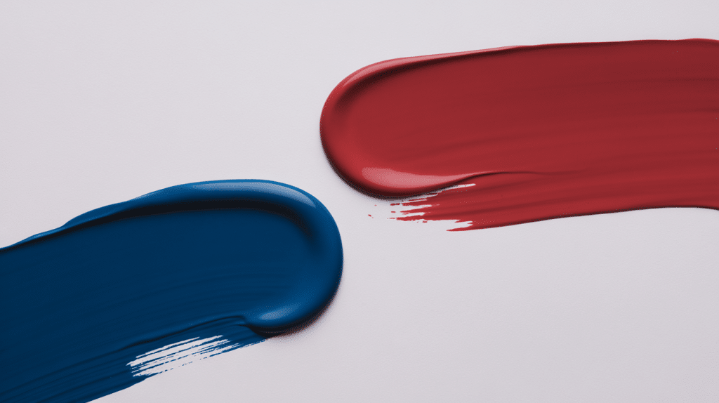
Blue and red stand as two of the most powerful primary colors in art, design, and fashion. These versatile hues have shaped everything from masterful paintings to iconic brand identities.
When combined, they create something truly special that surpasses the sum of their individual impacts.
Understanding what red and blue make is essential for anyone working with color, whether you’re exploring how red and blue make purple in traditional art or magenta in light applications.
For artists seeking the perfect purple mix, designers planning a bold brand identity, or simply someone curious about color theory, understanding this fundamental pairing will change how you approach creative projects.
This guide will provide inspiration and practical examples of how these colors work together to create beautiful palettes that captivate and inspire.
What Do Red and Blue Make?

When red and blue are mixed, they create purple or violet hues, a fundamental principle of color theory that forms the foundation of countless artistic and design applications.
The final result depends heavily on the variations you choose, as deep blues paired with bright reds create rich, intense purples, while soft pastels produce gentle lavender tones.
Muted versions of both colors yield refined, understated results that work beautifully in professional settings.
It’s essential to note that the combination appears differently across media, with paint mixing following traditional color theory.
At the same time, digital applications utilize RGB and CMYK color models that can produce varying results on screens versus in print.
Key points to remember:
- Traditional mixing: Red + Blue = Purple/Violet
- Color intensity varies based on the specific shades chosen
- Digital colors may appear different from physical paint mixing
- Pastel combinations create softer, more subtle results
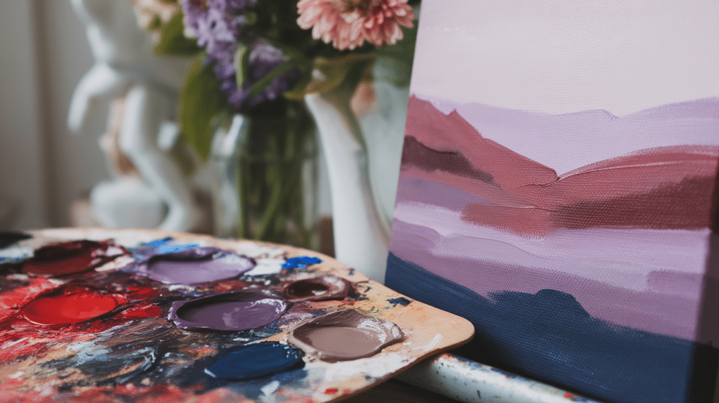
Creating Purple Variations: A Complete Mixing Guide
Achieving a standard purple from red and blue is just the beginning. Most artistic projects require specific purple tones that match your vision, from delicate lavender to deep plum shades.
Crafting Lighter Purple Tones
Begin with your red-blue purple base and introduce white in tiny increments. Each addition should be roughly 10% of your total mixture to maintain control over the final shade.
Advanced techniques for lighter purples:
- Blend thoroughly after each white addition to prevent chalky streaks
- Add a small amount of red alongside white to maintain warmth and prevent the color from becoming too cool
- Test your mixture on a separate surface before committing to your main project
- Remember that lighter purples appear more vibrant when surrounded by darker colors
Developing Deeper Purple Shades
Extra blue enriches your purple while maintaining color saturation. This method produces jewel-tone purples that retain their vibrancy even in deeper shades.
Techniques for rich, dark purples:
- Introduce blue gradually to avoid overpowering the red component
- Use burnt umber instead of black for more natural-looking dark tones that won’t muddy your color
- Experiment with small amounts of complementary colors like yellow-orange to create complex, sophisticated purples
- Consider using ultramarine blue specifically, as it contains slight red undertones that enhance purple mixtures
Blue and Red Together: Psychological Impact
Blue invokes feelings of calm, trust, and stability, while red sparks passion, energy, and excitement. Together, they create a compelling emotional balance that can be both soothing and stimulating.
Blue traditionally connects us to the sky and ocean, triggering feelings of peace and reliability, while red relates to fire and blood, instantly activating our attention and energy systems.
When these powerful colors appear together, they create a unique psychological tension that can be both comforting and energizing at the same time.
- Emotional Responses: Blue invokes feelings of calm, trust, and stability, while red sparks passion, energy, and excitement. Together, they create a compelling emotional balance that can be both soothing and stimulating.
- Cultural Significance: This color pairing holds profound significance across various cultures. National flags, sports teams, and traditional symbols frequently feature blue and red, representing strength, patriotism, and unity.
- Energy vs. Calm: The contrast between these colors can create either harmony or tension. Used skillfully, they complement each other beautifully. Poor execution can result in visual conflict that feels jarring.
Creative Palettes Featuring Blue and Red
The versatility of blue and red allows for countless palette combinations that suit different moods, seasons, and design purposes.
From bold, high-contrast schemes to gentle, harmonious blends, these colors adapt to both traditional and contemporary applications.
Understanding how to balance their intensity and temperature creates palettes that feel intentional and professionally crafted.
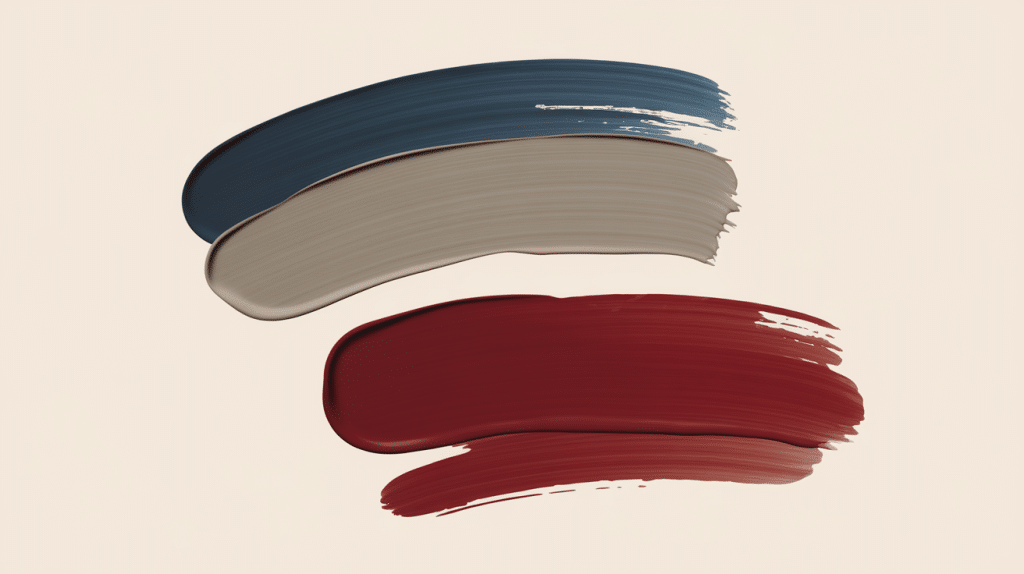
Classic Blue and Red Combinations
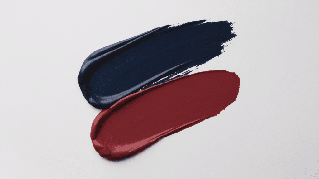
Traditional pairings like navy blue and scarlet red work perfectly for patriotic themes. Crimson and cobalt blue create striking contrasts ideal for bold statement pieces.
- Time-tested combinations used in vintage poster designs and corporate branding
- Deep tones convey authority and confidence
- Particularly effective for formal applications and traditional settings
Contemporary Blue and Red Palettes
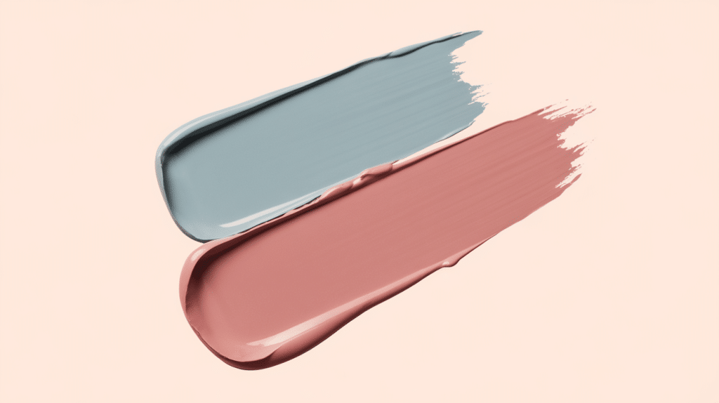
Modern combinations use pastel territories with soft blues and blush reds, or venture into fresh pairings like turquoise and coral red for modern, vibrant applications.
- Popular choice for user interfaces and social media graphics
- Allow for experimental approaches while maintaining visual cohesion
- Works well across different platforms and media
Muted and Neutral Variations
Softer palettes incorporate blue and red tones with beige, gray, or cream to balance intensity while maintaining visual interest.
- Ideal for professional environments where subtlety is key
- Prevent colors from competing for attention
- Perfect for office spaces, healthcare facilities, and residential interiors
Gradient Combinations
A gradual shift between blue and red creates eye-catching ombre effects perfect for current design applications.
- Works particularly well in digital backgrounds and textile patterns
- Add depth and movement to static designs
- Guide the viewer’s eye through important information or focal points
Why Does Mixing Red and Blue Not Always Make Purple?
The reality of color mixing is more complex than the simple formula taught in elementary art classes. Several factors can prevent red and blue from creating the expected purple result.
Color Temperature Matters: Warm reds (with yellow undertones) mixed with cool blues (with green undertones) often create muddy brown or gray colors instead of vibrant purples.
Paint Quality and Pigments: Cheap paints often contain fillers and multiple pigments that can interfere with clean color mixing.
Proportions and Saturation: Too much of either color can overpower the mix, while low-saturation or muddy base colors will produce dull results regardless of proper mixing technique.
Medium Differences: Watercolors, oils, acrylics, and digital colors all behave differently when mixed. What works in one medium may not translate directly to another due to varying pigment properties and mixing behaviors.
Purple vs. Violet vs. Indigo
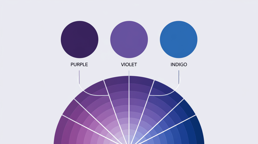
Understanding the distinctions between these three colors helps clarify the range of results possible when mixing red and blue.
1. Purple
It refers to colors that contain both red and blue in relatively balanced proportions.
True purple sits directly between red and blue on the color wheel and appears as a rich, royal color often associated with luxury and nobility.
2. Violet
Technically, it describes colors that lean more heavily toward the blue side of the spectrum.
Violet appears in the visible light spectrum as a distinct color, while purple is created through mixing and doesn’t exist as a single wavelength of light.
3. Indigo
It represents the deep blue-purple colors that fall between blue and violet on the spectrum.
Traditionally considered one of the seven colors of the rainbow, indigo appears darker and more blue-dominant than typical purple mixtures.
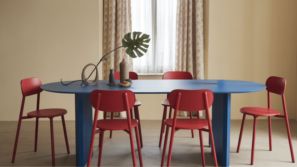
Blue and Red in Interior Design
Interior designers frequently turn to blue and red combinations for their ability to create spaces that feel both comfortable and energizing.
The key to success lies in understanding how to balance these intense colors to achieve the desired mood and functionality in any space.
Room Inspirations
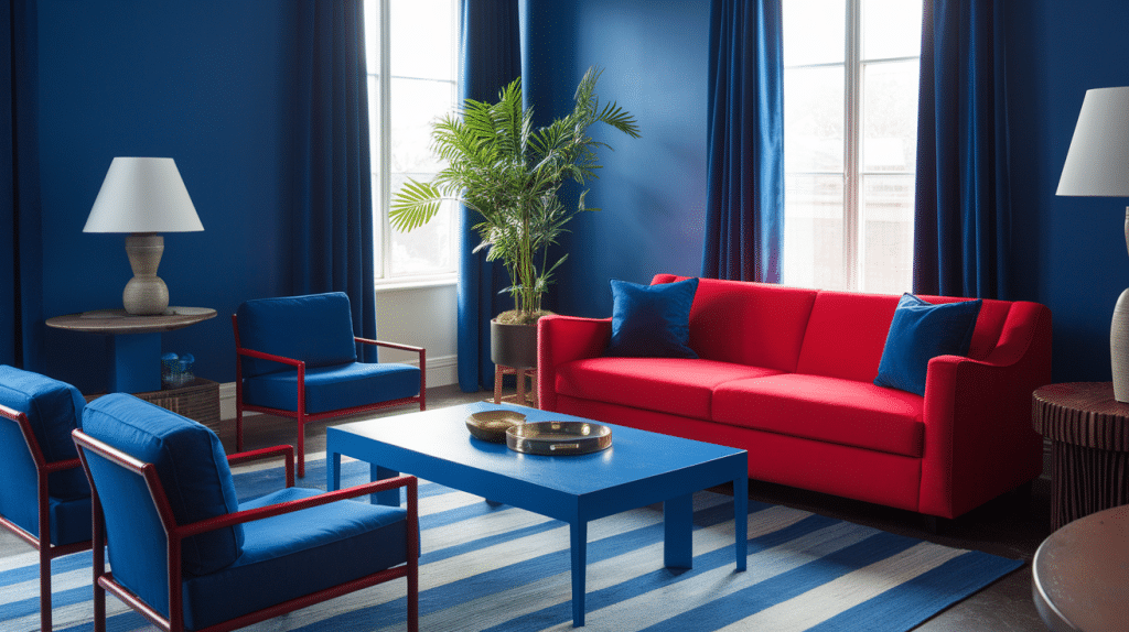
Create statement pieces by using blue walls with red accents in living spaces. This combination works particularly well in areas where you want both comfort and energy.
Blue and Red in Small Spaces
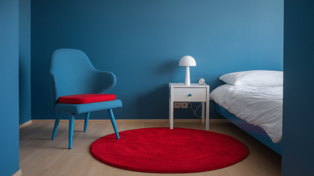
Integrate these colors thoughtfully in smaller rooms by using red in accessories and blue in larger furniture pieces or wall treatments to avoid overwhelming the space.
Real-Life Examples
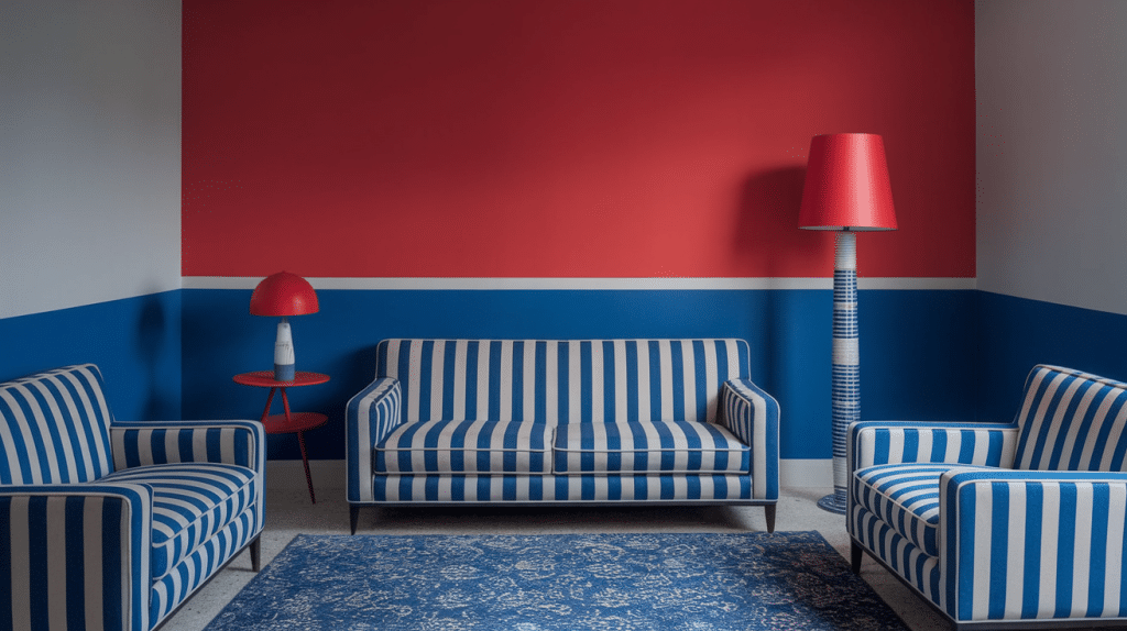
Popular interior design projects feature blue and red combinations across various styles, ranging from contemporary minimalist approaches to vintage-inspired and traditional applications.
Fashion and Style: How to Rock Blue and Red Together
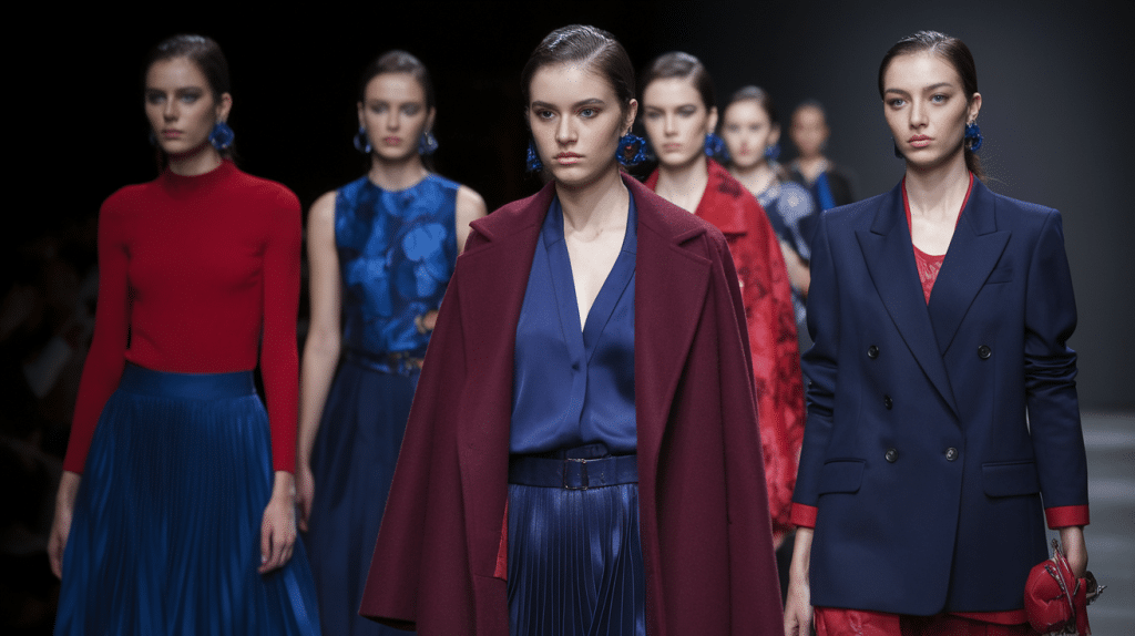
The fashion world has long celebrated the versatility of blue and red combinations, from classic American sportswear to high-end runway collections.
These colors offer many styling possibilities, whether you prefer subtle coordination or bold contrasting statements.
Understanding how to mix these hues effectively can change your wardrobe and help you create looks that are both polished and memorable.
1. Outfit Inspirations: Mix blue and red in both casual and formal wear. Navy blazers with red accessories create classic looks, while denim paired with red tops offers relaxed styling options.
2. Seasonal Fashion Palettes: These colors adapt beautifully to different seasons. Summer calls for nautical themes with navy and red stripes, while winter embraces deep burgundy and navy combinations.
3. Textile Pairings: Patterns like stripes, florals, and geometric designs that blend blue and red create lasting appeal in fashion applications.
4. Iconic Fashion Moments: Fashion history celebrates numerous memorable blue and red combinations, from classic American sportswear to haute couture runway presentations.
What Color Do Red and Blue Make With Lights?
If you’re mixing red and blue lights, the result is no longer purple. In this scenario, red and blue make magenta.
Blue and red are still primary colors for lighting, but the mixture of colors that our eyes perceive is slightly different from the mixtures used in paint.
Understanding the Light Spectrum
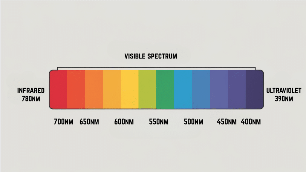
Electromagnetic radiation depends on the frequency of wavelengths, and in the middle of that spectrum is light visible to the human eye.
One interesting aspect of this spectrum is that temperature closely correlates with the color of light.
When objects increase in temperature, the energy released has shorter wavelengths, making it appear different to the human eye. It’s why you might see a flame turn from red to blue as it gets hotter.
Understanding colors, wavelengths, and temperatures in this manner helps astronomers gain a deeper understanding of space.
However, for most humans, the impressive spectrum of light is just the ordinary way we perceive the world. When we look at colors, a lot more is happening than we think.
Putting Blue and Red to Work for You
The combination of blue and red offers remarkable emotional, cultural, and visual power.
These colors work together to create palettes that are both classic and contemporary, making them suitable for a wide range of applications.
Understanding what red and blue make and how they interact opens up new possibilities for creative expression.
If you’re planning a room redesign, choosing an outfit, or developing a brand identity, this color combination provides a solid foundation for impactful design choices.
Experiment with different shades, tints, and applications to find the ideal blue and red palette that suits your needs. The possibilities are abundant when you master this classic color combination.
What’s your favorite blue and red combination? Share your thoughts in the comments below and tell us how you’ve used these colors in your projects.