Are you tired of plain white and gray walls that lack life? Sherwin-Williams’ Sticks & Stones (SW 7503) offers something better – a rich, natural color that sits between gray and brown, working well in almost any room.
Most basic colors look flat and dull over time. But Sticks & Stones brings real depth to your walls. It feels warm enough to make rooms cozy, yet still looks clean and planned in formal spaces. This color changes slightly as the day goes on – sometimes looking more gray, other times showing hints of brown.
Home experts often pick Sticks & Stones when clients want rooms that feel both new and classic at once. It works well with wood, metal, and fabric, making it a safe bet for many homes. The color gives walls life without being too bold.
Want to see why this special neutral keeps winning fans? Keep reading to learn how Sticks & Stones can give your home both class and comfort that lasts for years.
Sherwin-Williams Sticks & Stones Overview
| Attribute | Details |
|---|---|
| Color Name | Sticks & Stones |
| SW Color Code | SW 7503 |
| Location Number | 283-C6 |
| LRV (Light Reflectance Value) | 31 |
| RGB Values | 164 / 150 / 137 |
| Hex Value | #A49689 |
| Color Family | Neutral |
| Color Collections | Naturals, Living Well |
| Available In | Interior/Exterior |
| Description | A rich, versatile taupe with balanced warm undertones that bridges gray and brown for a sophisticated, earthy appeal |
Psychological Impact of Rich Neutrals
Sophisticated neutrals like Sticks & Stones create profound psychological effects that extend beyond simple aesthetics:
- Ground spaces with a sense of stability and permanence
- Reduce visual noise and promote mental clarity
- Create perceived warmth and security
- Foster connection to natural elements and materials
- Balance stimulation with relaxation, particularly beneficial in busy households
How Sticks & Stones Evokes Warmth, Substance, and Versatility
Sticks & Stones occupies a unique position in the color spectrum, perfectly balancing the sophistication of gray with the warmth of brown:
Warmth: Unlike cooler grays that can sometimes feel distant or clinical, Sticks & Stones radiates a gentle, enveloping warmth that makes spaces instantly welcoming. This innate warmth creates rooms that feel lived-in from the moment the paint dries, bypassing that sterile period many newly painted spaces experience.
Substance: There’s a remarkable depth to Sticks & Stones that gives it visual weight and presence. This isn’t a flat or one-dimensional neutral—it’s a color with character and complexity that reveals different facets depending on lighting conditions and surrounding elements. This substance ensures spaces feel intentional rather than simply safe.
Versatility: Perhaps most impressive is the color’s remarkable adaptability across different design aesthetics. From rustic farmhouse to sleek contemporary, from traditional to transitional, Sticks & Stones provides a sophisticated foundation that enhances rather than competes with other design elements. This chameleon-like quality makes it particularly valuable for homes with connected spaces or for those who enjoy evolving their decor over time.
Who Loves Sticks & Stones Color
Sticks & Stones appeals to individuals with discerning tastes who appreciate subtlety and longevity:
- The design enthusiast seeking something more interesting than standard grays or beiges
- Professionals who want homes that feel simultaneously sophisticated and welcoming
- Those who value connection to natural elements without literal interpretations
- People who entertain frequently and need versatile backdrops for various occasions
- Anyone looking to create spaces with lasting appeal that transcends trends
This color particularly resonates with those who find stark whites too clinical, pure grays too cool, and conventional beiges too predictable. Sticks & Stones offers the perfect middle ground—distinctive enough to make a statement, neutral enough for everyday living, and complex enough to remain interesting over time.
Rooms Made Better with Sticks & Stones
Kitchens
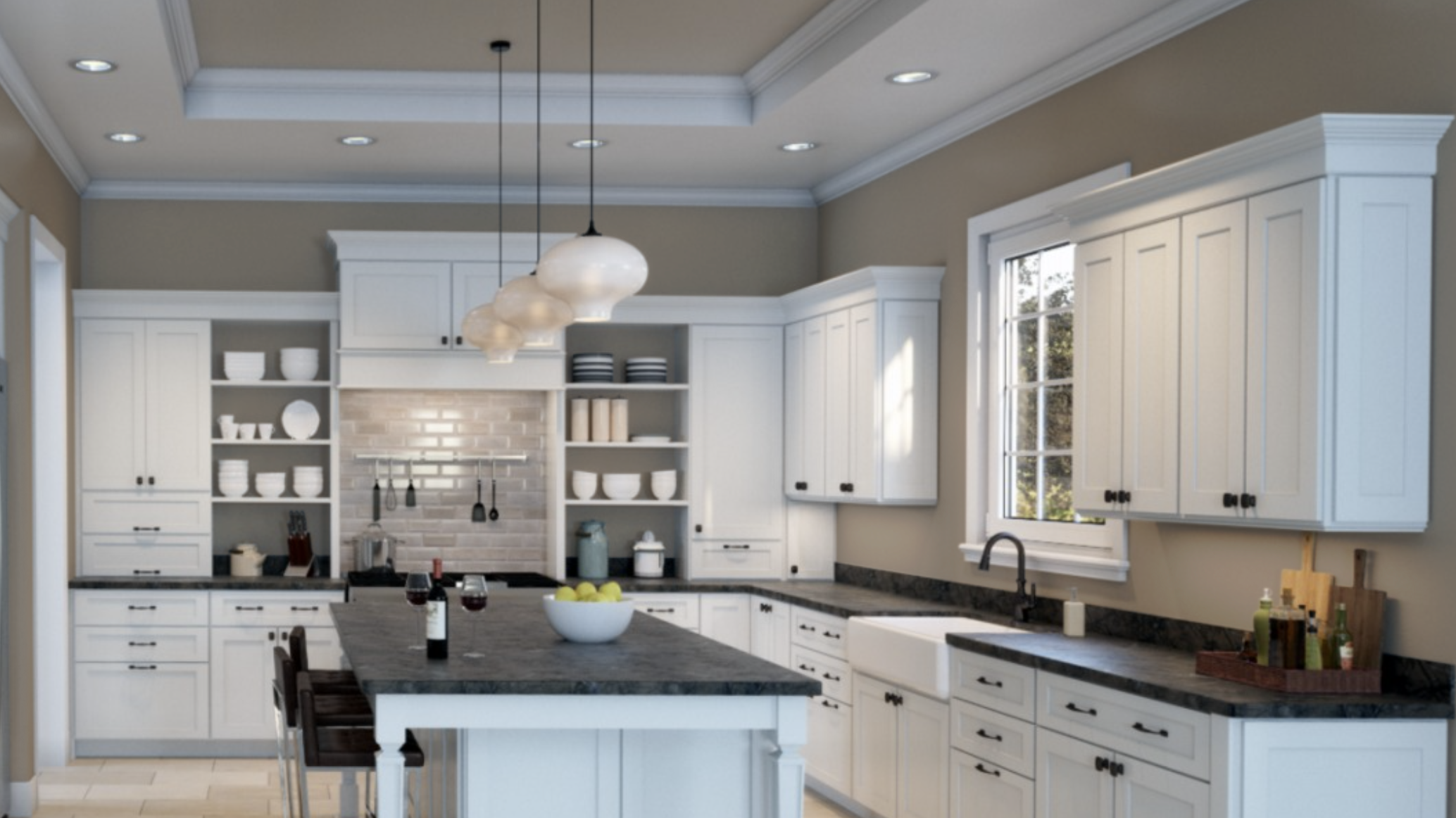
In kitchen spaces, Sticks & Stones brings warmth and substance without competing with the functional elements that necessarily populate the room. On cabinetry, it creates a rich, furniture-like quality that elevates standard installations to custom-feeling statements.
As a wall color paired with white or wood cabinets, it adds depth that prevents the kitchen from feeling utilitarian or clinical. Particularly effective in kitchens with natural stone elements, Sticks & Stones picks up subtle variations in marble, granite, or quartzite, creating harmonious connections that feel curated rather than contrived.
The color’s practicality shouldn’t be overlooked either—its medium tone helps camouflage the inevitable splashes and marks that accumulate in hardworking kitchen spaces.
Living Rooms
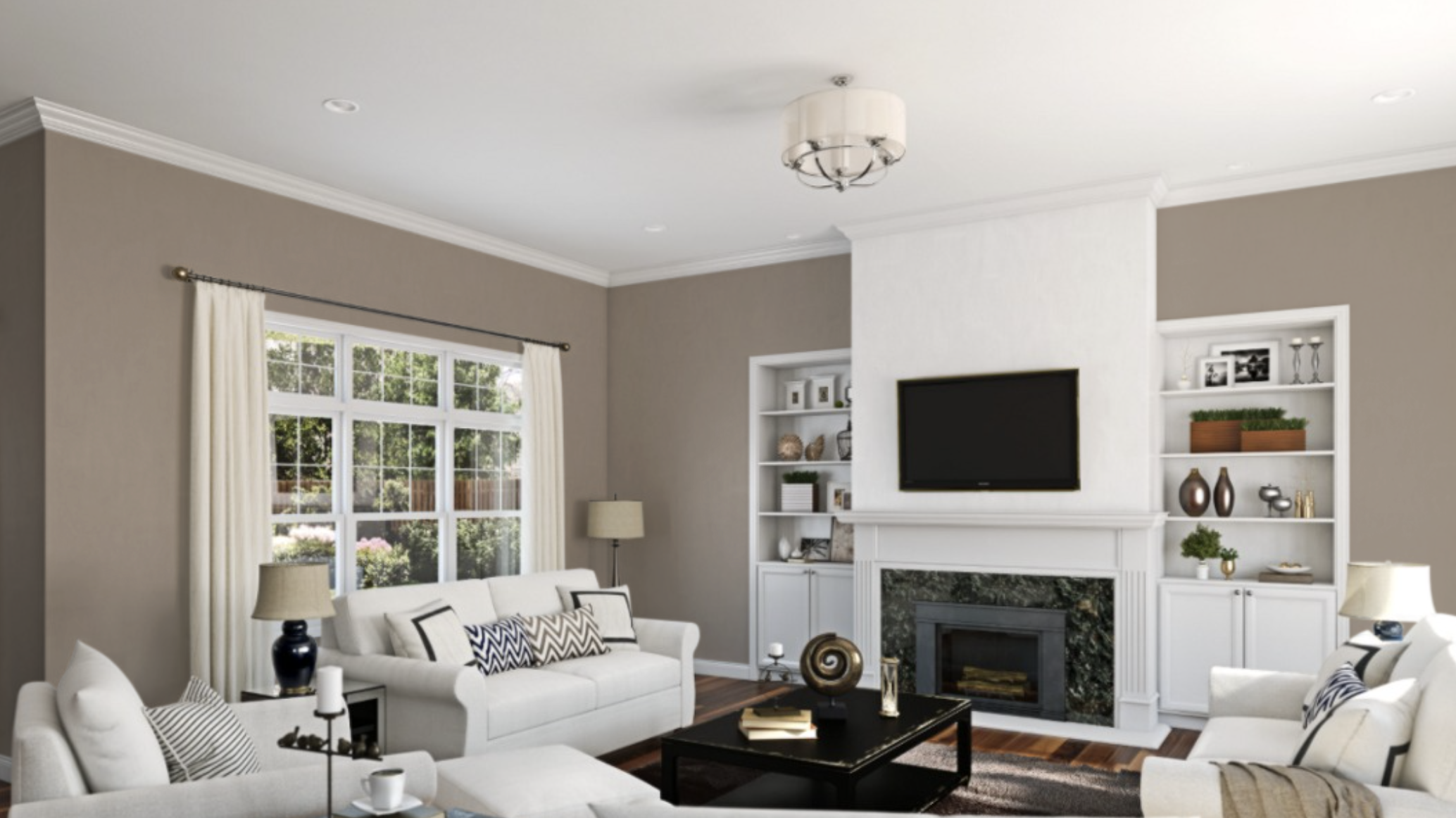
Living areas dressed in Sticks & Stones achieve that elusive balance between sophistication and comfort. The color creates a cocooning effect that makes even larger rooms feel intimate and inviting, while its depth provides a sophisticated foundation for both casual family time and more formal entertaining.
Particularly effective when carried onto millwork and built-ins, Sticks & Stones creates architectural interest even in builder-basic spaces. Its neutral quality makes it an exceptional backdrop for art collections, allowing paintings and photographs to stand out without competing with wall color.
As natural light shifts throughout the day, Sticks & Stones living rooms reveal different aspects—brightening to a warm gray in morning light and deepening to a rich taupe by evening.
Bedrooms
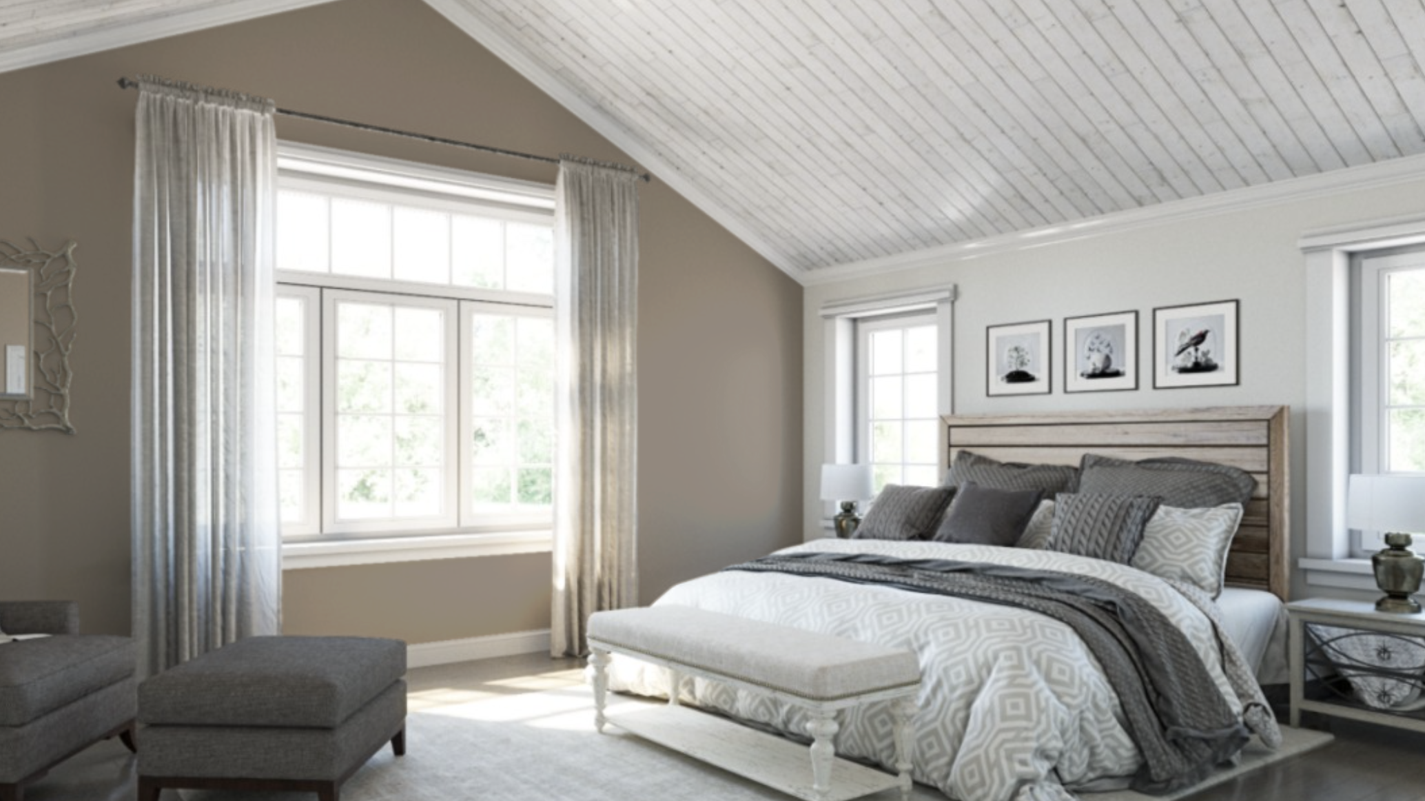
In sleep spaces, Sticks & Stones reveals its most restful qualities, creating bedrooms that feel like genuine sanctuaries. The color’s natural associations promote deep relaxation, while its depth creates the perception of enveloping comfort.
Neither too feminine nor too masculine, it serves as an excellent compromise for shared bedrooms with diverse style preferences. The neutral foundation pairs beautifully with various bedding colors and patterns, from crisp whites to jewel tones to organic linens.
When applied to both walls and trim for a monochromatic approach, Sticks & Stones creates sophisticated, hotel-like retreats; when contrasted with white woodwork, it maintains a more traditional aesthetic without feeling conventional or expected.
What Colors Pair Well With Sticks & Stones
Complementary Colors: Soft Whites, Antique Gold, Deeper Taupes
Sticks & Stones creates sophisticated harmony when paired with soft whites like Alabaster (SW 7008) or White Duck (SW 7010). These warm whites provide contrast without starkness, allowing Sticks & Stones’ subtle complexity to be fully appreciated while creating visual breathing room. The combination feels refined and balanced rather than harsh.
Metallic elements in antique gold or aged brass enhance Sticks & Stones’ natural warmth. These metals echo the golden undertones in the taupe, creating a relationship that feels organic rather than contrived. This pairing works particularly well for hardware, lighting fixtures, and decorative accents.
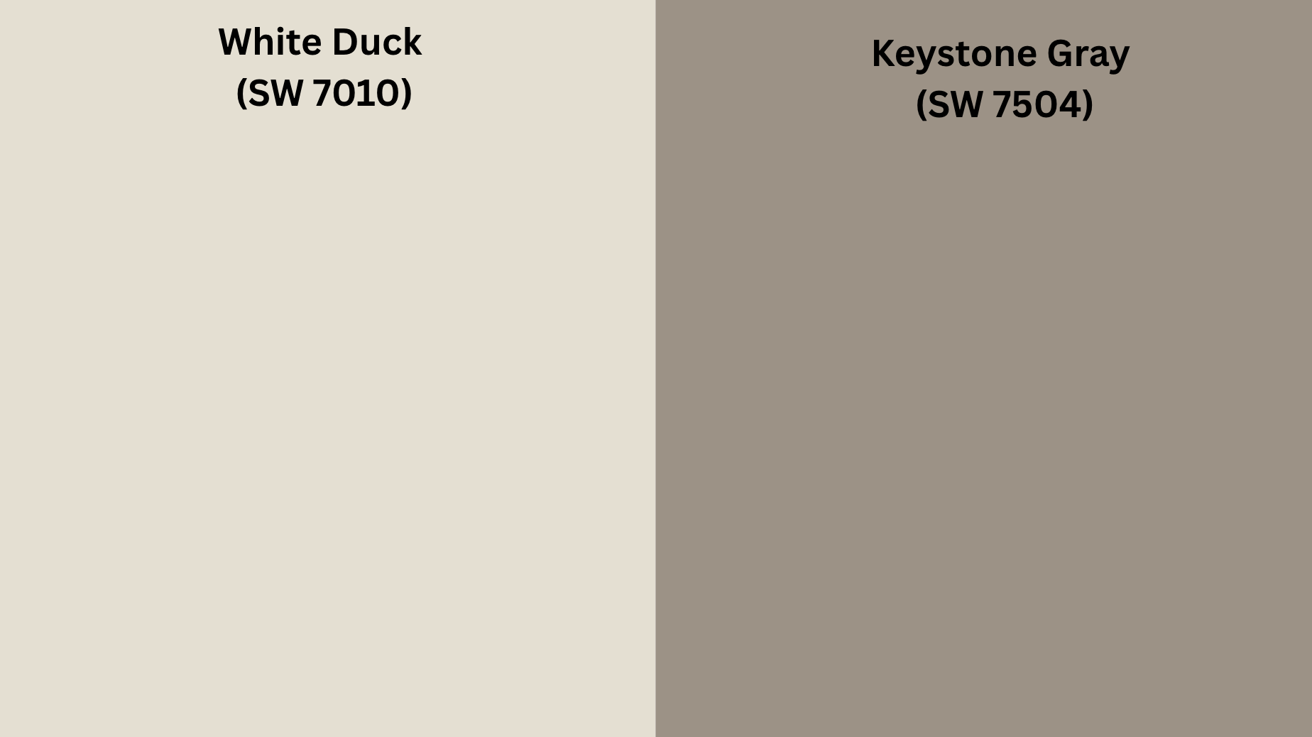
For a layered, monochromatic approach, deeper taupes like Keystone Gray (SW 7504) or Backdrop (SW 7025) create sophisticated depth with Sticks & Stones. This tone-on-tone strategy creates rich visual texture without introducing contrasting colors, resulting in spaces that feel cohesive and thoughtfully curated.
Contrasts: Muted Blues, Soft Sages, Deep Charcoals
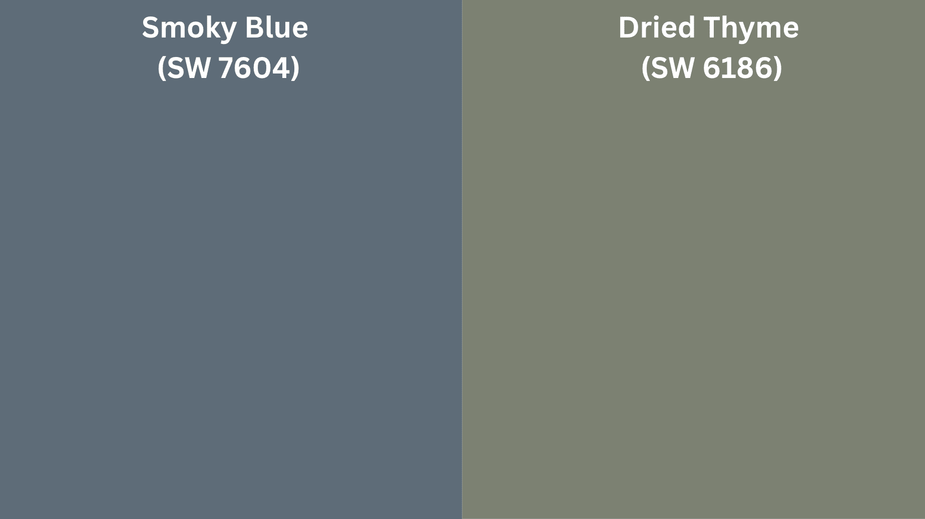
For sleek contrast, muted blues like Smoky Blue (SW 7604) or Downing Slate (SW 2819) create a sophisticated pairing with Sticks & Stones. This combination feels both current and timeless, offering enough contrast to create interest without feeling jarring or trendy.
Soft sage greens such as Clary Sage (SW 6178) or Dried Thyme (SW 6186) offer natural companionship to Sticks & Stones. This pairing mirrors relationships found in nature—earth and vegetation—resulting in spaces that feel inherently harmonious despite the contrast.
For more dramatic definition, deep charcoals like Iron Ore (SW 7069) create architectural emphasis when paired with Sticks & Stones. This high-contrast relationship works particularly well for defining millwork, window frames, or creating accent walls that add depth and dimension to neutral spaces.
Sherwin-Williams Suggestions for Palettes
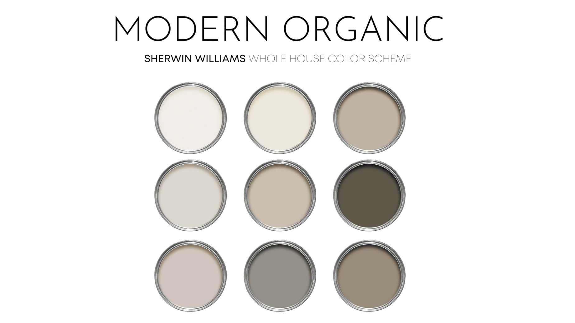
Modern Organic Palette:
- Sticks & Stones (SW 7503) – Main walls
- Pure White (SW 7005) – Trim and ceilings
- Retreat (SW 6207) – Accent elements
- Urbane Bronze (SW 7048) – Architectural details
Refined Neutrals Palette:
- Sticks & Stones (SW 7503) – Feature walls or cabinetry
- Shoji White (SW 7042) – Secondary walls
- Homburg Gray (SW 7622) – Coordinating color (darker)
- Loggia (SW 7506) – Coordinating color (lighter)
Transitional Contrast Palette:
- Sticks & Stones (SW 7503) – Main color
- Alabaster (SW 7008) – Complementary walls
- Naval (SW 6244) – Accent color
- Marshmallow (SW 7001) – Lightening elements
Conclusion
Sticks & Stones stands out from other plain colors. It’s a smart choice that works well in many settings and will keep looking good for years. This rich taupe makes rooms feel well-planned rather than just safe, with a look that’s special without trying too hard.
What makes this color so good is how it finds the middle ground. It works for people who think gray feels too cold and beige looks too plain. As light changes during the day, the color shows new sides of itself, making walls more fun to look at.
More people now want homes that feel real and lasting. Sticks & Stones gives them just that with its strong, down-to-earth look that still fits with many styles.
From kitchen cabinets to living room walls, this long-lasting neutral helps create spaces that feel both fresh and classic. This is what makes truly good design – colors that stay looking good no matter what the latest fads might be.
