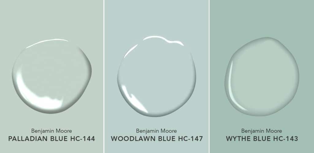
Choosing the right paint for your place is an important decision that dramatically impacts its ambiance and style. Palladian Blue Benjamin Moore has been a popular choice among interior designers and owners. Known for its timeless elegance and soothing feel, Palladian Blue has been a choice to create a peaceful environment.
In this review, we explore the characteristics and applications of Palladian Blue Benjamin Moore, providing insights to help you choose a color for your place.
Being a part of the pale blue family, this color offers a delicate charm that is calming. The color has a subtle green undertone, making the hue match light aqua. The versatile finish complements various styles of designs, from traditional to modern.
Palladian Blue Benjamin Moree Color Characteristics
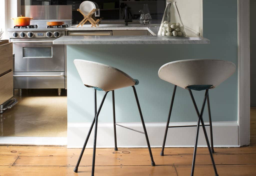
Palladian Blue Benjamin Moore is a fascinating color with characteristics that enhances the appeal of the color and the application area alike. The color falls in the family of muted blue colors, which gives a sense of peace. The soft and gentle tones create calmness, thus being a popular choice for peaceful environments. The defining feature of this color is the subtle green undertones to give it a fresh vibe and make it distinct from other colors of the same spectrum. Green infusion creates a balance that gives off a feel of an ocean retreat.
Its versatility blends seamlessly with modern and traditional designs that, make it an apt choice for homeowners and designers. The appearance of the color can vary depending on the lighting conditions. Under natural light, the color gives off a fresh glow that focuses on the green undertones. Under artificial light, the color focuses more on the natural blue color, thus appearing cooler.
Versatility and Application
1. Interior Spaces
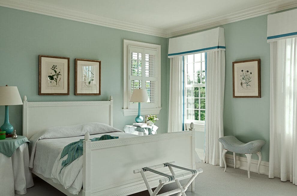
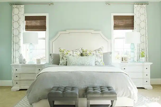
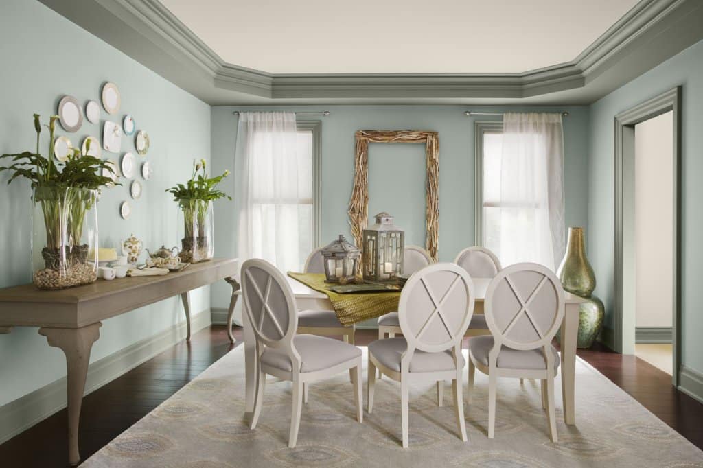
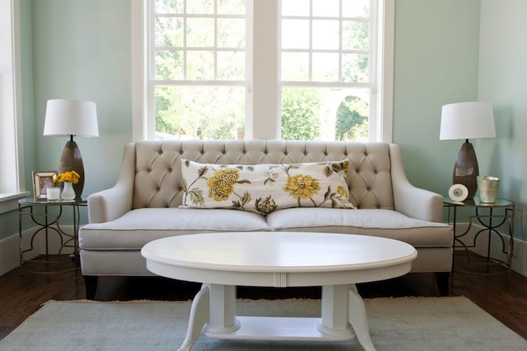
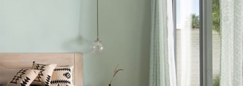
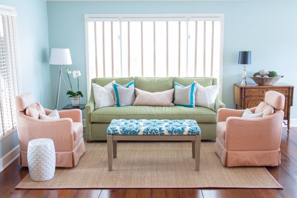
Palladian Blue helps transform your rooms into a peaceful retreat. It is well-suited for bedrooms, bathrooms, and living rooms. The soothing nature of this color creates a calm and serene atmosphere that helps you relax. In bedrooms, the color offers a soothing backdrop that enhances sleep quality and overall health. Pairing the color with soft whites creates a dreamy atmosphere.
When used in bathrooms, this color creates a spa-like atmosphere where the watery hues complement the fixtures that, creates a soothing and relaxing atmosphere. For living rooms, the color brings a sense of calm to a common gathering area. The color pairs perfectly with different furniture styles and creates a refreshing ambiance.
2. Exterior Spaces
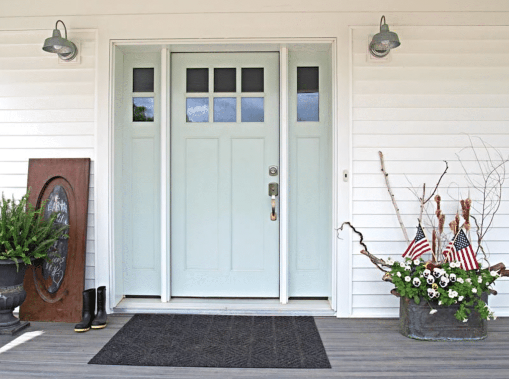
While Palladian Blue Benjamin Moore is predominantly used for interior spaces, it can also be used for exterior spaces to enhance the overall appeal of your home. You can use the color to paint your doors to give a pop of color to the exterior of your home. The green undertones pair well with the natural surroundings creating a refreshing entrance. You can also paint the garage or exterior shutters to create a charming ambiance that pairs well with the home’s exterior elements, like bricks.
Additionally, the color pairs well with architectural details like porch accents, window frames, and trims. This adds elegance to the exterior design of your home. You can even use the colors for outdoor furniture and planters. By using the color strategically, you can enhance the outdoor space and make it more inviting.
It is important to consider the color scheme of your house exterior, as the color pairs well with neutral shades for a balanced look. It is recommended to spot check to check the overall appeal of the color and achieve the required aesthetic.
3. Color Coordination
Palladian Blue Benjamin Moore gives you multiple options for color coordination, allowing the designers to create visually pleasing color combinations. With neutrals, this color creates a sophisticated look. White creates a crisp and clean contrast with the blue color. Beige and grays also create a striking yet balanced combination with Palladian Blue allowing it to be the center of the stage.
With warm tones such as warm taupe and muted browns, these colors complement the cool tones of blue. With pastels, blue combines to give off a soothing and delicate color scheme. With lavender or pale yellow, the color combines to create a romantic atmosphere. The green undertone of Palladian Blue combines well with green accents that create a nature-inspired atmosphere. Leafy green and similar colors bring a fresh vibe to the space. You can explore more shades of the blue-green spectrum to create a monochrome effect that creates a striking atmosphere.
4. Design Styles
Palladian Blue Benjamin Moore seamlessly integrates into multiple design styles and creates amazing aesthetics and moods within a space. For traditional, Palladian Blue gives an elegant appeal to the design by pairing it with classic furniture and details. A brass and gold finish enhances the luxe appeal of the place. With a coastal theme, you can combine the blue-green hue effortlessly for a beach-inspired vibe. Pairing well with light-colored woods and nautical details to create a coastal retreat.
Farmhouse-styled interiors pair amazingly with Palladian Blue to create a soft and serene backdrop while integrating seamlessly with rustic wood and wrought iron. For a transitional design, combine traditional and modern styles with the amazing Palladian Blue to act as a transitional element between the styles. You can learn more about the design styles (here) and experiment with ways to combine the color with various styles.
Lighting Considerations
Lighting plays an important role in how the colors appear inside a space. Palladian Blue Benjamin Moore is no exception as lighting alters the visibility of the color. Some important lighting adjustments that can be made with Palladian Blue are:
1. Natural Light
Palladian Blue gives off its best views under natural light. When exposed to sunlight, the color emphasizes its green undertones thus appearing vibrant and airy. It creates a fresh atmosphere giving a feel of a sunlit oasis. The reflective properties bounce off across the walls to enhance the brightness of the space. You can observe the difference in colors from morning to evening and appreciate the shift in its hue. It is recommended to use the color in rooms with large windows to capture its beauty.
2. Artificial Light
The use of artificial light can alter the perception of Palladian Blue. Different kinds of light bulbs like warm and light toned can change the appearance of the color. It is important to note the color temperature of the light source and how the color reacts to it. Cool-toned bulbs enhance the blue tones of the color, while warm-toned bulbs emphasize the green tones by muting the blue. If you use shades on the bulbs, the shades can diffuse and give off various lighting effects to the color.
3. Direction and Intensity
- Direction: The direction alters and affects how the color looks. When positioned directly above the color, it casts shadows and gives an illusion of depth, which enhances the texture of the surface. Experimenting with the direction and angles can affect how the color is viewed in your living space.
- Intensity: The intensity affects how the color looks in your living space. Bright and intense light can make the color look more vibrant and create a fresh atmosphere. Dimmer lights can soften the color effect, which creates a soothing atmosphere. Adjusting the light intensity allows you to reach the desired mood.
- Light Control: When working with Palladian Blue, controlling and adjusting the lighting direction and intensity is important. Use dimmer switches, shades, and fixtures that are adjustable to get the desired lighting effect. This allows you to showcase the tones in all its glory.
4. Layered Lighting
Incorporating layered lighting techniques can enhance the visibility of Palladian Blue. Combine multiple light sources to illuminate and create dynamic effects. Consider using overhead lights, wall sconces, and floor lamps to play with the lighting to enhance the blues and greens. You can accentuate the color visibility by strategically placing and using lights in your room.
Pairing Options
Palladian Blue Benjamin Moore gives multiple pairing options allowing you to make visually appealing color combinations, to make the best combinations, here are a few suggestions you can use:
1. Neutrals
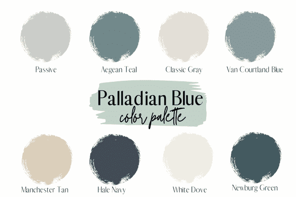
Palladian Blue pairs well with neutral shades to create a sophisticated appearance. Neutral hues create a backdrop that allows blue to stand out. You can pair the color with crisp white shades to create a fresh aesthetic. White Dove Benjamin Moore can be used as it complements the coolness of the blue and create a clean contrast. With soft grays, you can pair the blue to create an elegant combination. Revere Pewter Benjamin Moore can be used to balance the coolness of the blue to create a harmonious atmosphere.
Taupe and beige shades create a warm atmosphere when combined with Palladian Blue. Grant Beige Benjamin Moore gives a grounded feel when mixed with Palladian Blue, allowing it to shine for a refreshing feel. The off-white color pairs well with the blue to create a soft ambiance. Ivory White Benjamin Moore creates a simple contrast to create a tranquil atmosphere that is perfect for your bedroom.
2. Warm Tones
Pairing Palladian Blue with warm tones creates a cozy atmosphere. The warmth of the colors pair and complements the coolness of the color for a balanced look. The top choices that can be paired with Palladian Blue Benjamin Moore are Gold, Yellow, Orange, and Pink. Here, the Muted Gold color gives a luxurious appeal when paired with the blues. You can incorporate picture frames and other gold-toned accessories to bring out the richness of both colors. Soft yellow gives a sunny vibe to the room when paired with Palladian Blue to create a refreshing atmosphere. The combination provides a mix of warmth and coziness.
Rustic Orange gives a bold and vibrant look to the room that creates a contrast with the cool Palladian Blue. This can be used with textiles or artwork that combines well with the natural color of the room. Dusty rose pink creates a feminine contrast when paired with Palladian Blue. This creates a romantic atmosphere and can be incorporated with pillows and curtains to give the room an elegant look.
3. Complementary Colors
Pairing the blue with complementary colors gives a dynamic look to the room. You can use the coral color that is vibrant and complements well with Palladian Blue. Warm orange contrasting with Palladian blue creates a lively atmosphere. Peach can be complemented with blue to give off a warm feeling. Pairing these colors create a romantic atmosphere. Terracotta color beautifully complements Palladian Blue as the contrast between these colors creates a beautiful ambiance. Pair Palladian Blue with lime green to create a refreshing atmosphere.
You can pair these complementary colors with Palladian Blue Benjamin Moore to create a stylish, striking, and modern atmosphere. Incorporate these colors by using accented furniture, accessories, textiles such as curtains and bedding, and even artwork to create a balanced environment.
4. Analogous Colors
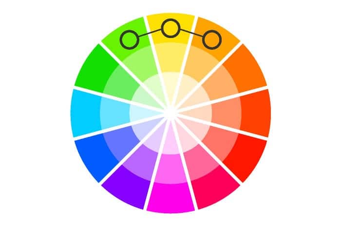
Analogous colors are the ones that lie adjacent to Palladian Blue on the color wheel, creating a balanced combination. Aqua falls between blue and green, which pairs beautifully with Palladian Blue creating a beach-like atmosphere. Seafoam Green can be paired to create a soothing environment by enhancing the calming qualities of Palladian Blue. Pair Palladian Blue with soft blue shades to create a monochromatic effect. This combination adds depth to the space.
You can choose to pair Palladian Blue with mint green to enhance the soft and airy atmosphere that matches the green undertones. These colors can be added with the use of furniture, accessories such as lamps and vases, and textiles such as pillows and curtains. Analogous colors create a balanced environment that soothes the eye. You can use other combinations which enhance the beauty of Palladian Blue.
Durability and Application Techniques
Palladian Blue Benjamin Moore provides durability and longevity when applied with precision. The durability depends on the surface preparation, application technique, and the environment where it is used in. For surface preparation, the surface must be clean, dry, and free of dust and other contaminants. Repairing the cracks and imperfections is highly recommended. Regular maintenance should be performed to extend the life of the color. Clean the surface gently and avoid using harsh chemicals. The application of paint correctly is an important part of extending the life of the paint. Multiple thin coats are better than using one thick coat as it provides better adhesion.
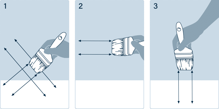
Using the right techniques while applying the paint is essential for a smooth finish. Using high-quality brushes is recommended while cutting in the edges first and then filling in larger areas is recommended. Rolling is an efficient technique to cover bigger surfaces. Using an appropriate roller according to the texture required is essential. A wet edge is recommended to avoid lap marks. You can spray paint larger areas using specialized equipment for consistent coverage.
Overall Impressions

Overall, Palladian Blue Benjamin Moore is a color that is versatile and creates a soothing environment. The soft and gentle blues combined with the subtle green undertones give off a fresh feel. This color adapts to multiple design styles, such as traditional, modern, and coastal, while seamlessly blending with them. In interiors, this color is suited for bedrooms and living rooms to create a soothing environment. Pairing beautifully with neutrals to give a sophisticated look to the room while offering you the choice to pair itself with bold colors that complement it. The lighting conditions are also an important factor.
For exterior applications, Palladian Blue Benjamin Moore gives a sophisticated look to the doors and architectural details. The green undertone of this color pairs well with the surroundings. Durability and application techniques are important to get the best results for this color. Surface preparation and correct application techniques are important for its long-lasting finish. Maintenance and care ensure its longevity. Palladian Blue Benjamin Moore is an impressive color that creates visually pleasing environments. You can use it as a dominant color or accent; the color is sure to give an elegant finish to the room.
Conclusion
A remarkable color choice: Palladian Blue Benjamin Moore to create a sophisticated and soothing space. The soft blue-green combination creates a fresh environment. The versatile design adapts to various design choices and colors suitable for both interiors and exteriors.
We hope that this little review helps you choose a suitable color for your home and create a sophisticated environment. If you want to transform your place into a refreshing and serene getaway, Palladian Blue Benjamin Moore is your go-to color.
Explore its harmonious pairs with neutral and warm tones to create a unique color scheme. Remember to follow proper preparation and application techniques for a professional finish. Explore the Palladian Blue color and be inspired for your next project. Create a tranquil environment and enhance the beauty of your home.
