

Picture walking into a room that instantly makes you feel calm and cozy. The walls seem to wrap you in warmth. Everything feels just right.
That’s the magic of nude colors.
These soft, natural tones surround us every day. Think about sandy beaches, warm coffee, or your favorite cozy sweater. These colors have a special way of making any space feel like home.
Nude colors aren’t boring. They’re actually super versatile. From soft beiges to gentle taupes, these shades work in bedrooms, kitchens, and even office spaces. They play well with bold colors, too.
The best part? These colors never go out of style. They’re like that reliable friend who always makes you feel better.
Ready to learn how these simple colors can change your spaces? Let’s see what nude palettes can do for your next project.
What Are Nude Color Palettes?
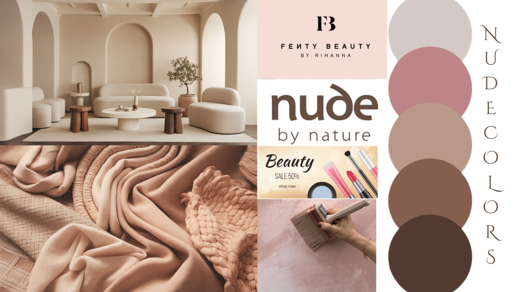
Nude color palettes consist of neutral, muted tones that include various shades of beige, taupe, blush, and soft earth tones.
These colors create emotional warmth and visual tranquility, offering a sense of balance and natural beauty.
The versatility of nude tones makes them suitable for numerous design contexts, providing a foundation that works harmoniously with both bold and subtle design elements.
Popular Nude Color Palettes and Their Combinations

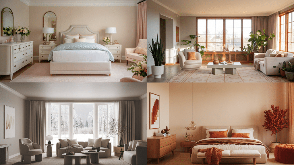
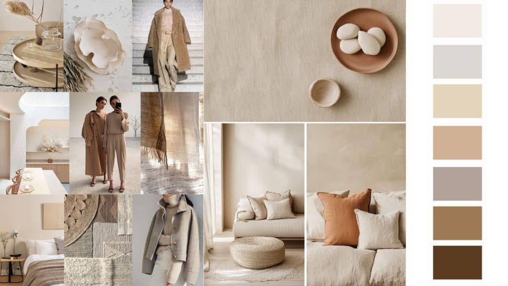
Soft Beige and Ivory: These light, gentle tones create airy, open spaces perfect for minimalist designs. They add warmth to cooler environments while maintaining a clean, fresh feel and refined appearance.
Warm Taupe and Brown: Rich, earthy tones like taupe provide a grounding, cozy effect in spaces. These deeper shades add visual depth and complement both modern and rustic design styles, bringing natural warmth that creates inviting and intimate environments.
Blush and Peach Nude Palettes: Light, warm tones of blush and peach add a soft, feminine touch to any project. These colors are ideal for creating spaces or designs that feel gentle, romantic, or tender.
Muted Greys and Mousy Tones: A cooler, more contemporary take on nude shades that work well with minimalist approaches. These tones create a refined, understated backdrop, often paired with sleek, modern designs.
Dusty Rose and Mauve: These slightly deeper nude tones with pink undertones offer more character while maintaining sophistication. They work particularly well in spaces that need subtle color without being too bold.
Mushroom and Greige: The perfect blend of grey and beige, these tones offer the best of both worlds – the coolness of grey with the warmth of beige. They’re particularly popular in contemporary homes and commercial spaces.
The Psychology Behind Nude Color Palettes
Understanding the psychological impact of nude colors can help you make more informed design choices.
These colors are associated with comfort, stability, and reliability. They create a sense of security and can help reduce stress and anxiety in living spaces.
In commercial settings, nude tones communicate professionalism and trustworthiness, making them popular choices for offices, spas, and hospitality venues.
Nude colors also have the unique ability to make spaces appear larger and more open. This is particularly beneficial in smaller rooms or urban apartments where maximizing the sense of space is important.
The light-reflecting properties of many nude shades can help brighten naturally dark spaces.
Seasonal Applications of Nude Color Palettes
The seasons change how we feel about colors in our homes. Different nude shades work better at different times of the year. Smart use of these tones can make spaces feel perfectly matched to each season.
1. Spring and Summer
Lighter nude tones like ivory, cream, and soft beige work beautifully during warmer months. These colors complement the natural light and create a fresh, airy feeling.
Pair them with white linens and natural textures like rattan or linen for a perfect warm-weather palette.
2. Fall and Winter
Richer nude tones like taupe, mushroom, and deeper browns are ideal for cooler months. These colors provide warmth and coziness during darker seasons.
Layer them with textured fabrics like wool, cashmere, or faux fur to create inviting winter retreats.
3. Year-Round Flexibility
The beauty of nude palettes lies in their adaptability. You can easily transition between seasons by simply changing accent colors and textures while maintaining the same nude base.
How to Pair Nude Color Palettes with Other Shades
Complementary Colors: Combining nude with other neutral shades like white, gray, or black creates a chic and balanced look. For example, a soft beige backdrop with a charcoal-colored sofa creates a sleek, modern living room.
Contrasting Accents: Pairing nude tones with bolder colors like deep blue, emerald green, or mustard creates visual interest. Using blush accents against dark navy walls in fashion or interior designs adds depth and vibrancy.
If you’re thinking about using navy as a bold accent, check out some of our favorite Hale Navy combos here for inspiration that really works with nude tones.
Pastels and Soft Tones: Nude tones work beautifully with pastel shades for a light, airy vibe. Combining soft taupe with pastel pinks or greens creates peaceful bedroom retreats or refined event decor.
Metallic Accents: Nude colors serve as perfect backdrops for metallic accents. Gold, copper, and bronze complement warm nude tones, while silver and chrome work beautifully with cooler nude shades.
Creative Ways to Use Nude Color Palettes in Design Projects
Nude colors work in so many different areas of design. From your living room to your closet, these gentle tones can make everything look better. The key is knowing where and how to use them for the biggest impact.
1. Interior Design
Living Spaces: Nude tones serve as perfect neutral backdrops, providing warm, welcoming environments. Use them on walls, furniture, or decor items to create balanced spaces that feel both comfortable and refined.
Kitchens and Bathrooms: Beige or taupe tones bring warmth and calm to functional spaces, creating inviting atmospheres that make daily routines more pleasant. Consider nude-toned tiles, countertops, or cabinetry for a cohesive look.
Accent Pieces: Consider incorporating nude accents through rugs, throw pillows, or vases, adding subtle refinement without overwhelming the space.
Bedrooms: Nude tones create the perfect environment for rest and relaxation. Use them on walls, bedding, or furniture to create a calming sanctuary that promotes better sleep.
2. Fashion and Textiles
Casual Wear: Nude tones in clothing give an effortlessly chic and understated vibe. Soft beiges, taupes, and blushes can be combined with other neutral tones or bold colors for versatile styling options.
Evening Wear: Nude tones also work beautifully in evening attire, especially when paired with metallics or jewel tones for added drama and visual impact.
Home Textiles: Use nude tones in blankets, curtains, and upholstery for a serene and cozy atmosphere that promotes relaxation.
3. Branding and Marketing
Logos and Website Design: Nude tones are often used in branding to convey luxury, simplicity, and professionalism. Their neutral nature makes them versatile across many industries, from beauty to hospitality.
Product Packaging: Brands that focus on clean design often use nude tones for product packaging, especially in beauty or eco-friendly industries. Nude colors can add a premium and polished feel to packaging.
Advertising: Nude shades can be used subtly in advertisements to allow products or messages to stand out without overwhelming the viewer.
Digital Applications: Nude tones work particularly well in website design, app interfaces, and social media graphics, providing a clean, professional backdrop that doesn’t compete with content.
4. Working with Different Design Styles
Modern and Contemporary: Nude colors work beautifully in modern spaces, providing a clean backdrop that allows architectural features and furniture to take center stage. Pair with sleek lines and minimal accessories for a contemporary look.
Scandinavian: The Scandinavian design philosophy embraces nude tones as part of their emphasis on simplicity and functionality. Combine nude walls with natural wood accents and white furnishings for an authentic Nordic feel.
Bohemian: Nude tones can serve as a grounding element in bohemian spaces, balancing more vibrant colors and patterns. Use them as a base while adding colorful textiles and artwork.
Traditional: Nude colors work well in traditional settings, providing a classic backdrop that won’t compete with ornate furnishings or decorative elements. They’re particularly effective in formal dining rooms or studies.
Industrial: Nude tones can soften the harsh edges of industrial design, adding warmth to spaces dominated by metal and concrete. They work particularly well when paired with exposed brick or weathered wood.
How to Incorporate Nude Color Palettes into Your Projects
When using nude palettes, balance them with other textures and materials such as wood, metals, or fabrics to create depth and visual interest.
A subtle and refined approach, using varying shades of the same nude color for a clean, streamlined design that feels cohesive and intentional.
Nude tones can serve as a base, allowing for accents of brighter colors to pop, whether through artwork, decor, or accessories.
Since nude palettes rely on subtle color variations, texture becomes crucial. Mix smooth and rough textures, matte and glossy finishes, and soft and hard materials to create visual interest.
Common Mistakes to Avoid
While nude palettes are beautiful, using too many similar tones without variation can create a flat, uninspiring space. Add contrast through different textures, patterns, or accent colors.
Not all nude colors work well together. Pay attention to undertones – warm beiges don’t always pair well with cool greys. Test colors together before committing to a palette.
Nude colors can look dramatically different under various lighting conditions. Always test your chosen colors in the actual space under different lighting scenarios.
Lighter nude tones can show dirt and wear more easily than darker colors. Consider the practicality of your color choices, especially in high-traffic areas.
Practical Implementation Tips
Start Small: If you’re hesitant about using nude tones, start with smaller elements like throw pillows, artwork, or accessories before committing to larger pieces like furniture or wall colors.
Sample First: Always test paint colors and fabric samples in your actual space before making final decisions. Colors can look very different in various lighting conditions and next to other elements in your room.
Consider the Room’s Purpose: Different nude tones work better in different spaces. Warmer tones might be perfect for a bedroom, while cooler tones could be better suited for a home office.
Think About Longevity: Nude colors are generally more enduring than trendy colors, but consider how your chosen palette will age over time and with changing design trends.
Maintenance and Longevity
Nude color palettes offer excellent longevity in design projects. Unlike bold colors that may feel dated after a few years, nude tones remain relevant and can be easily updated with new accent colors or accessories.
This makes them a smart investment for both residential and commercial projects.
For maintenance, lighter nude tones may require more frequent cleaning, especially in high-use areas. Consider using washable paints and stain-resistant fabrics in practical applications.
Final Thoughts on Using Nude Color Palettes
From interior design to fashion and branding, these understated tones provide a foundation for creating spaces and designs that feel both modern and inviting.
Their psychological benefits, seasonal adaptability, and compatibility with various design styles make them an excellent choice for both professional designers and DIY enthusiasts.
We encourage readers to experiment with these palettes in their own projects, as they provide countless possibilities for refined, contemporary, and welcoming designs.
Ready to refine your space with these enduring color palettes? Start by selecting one neutral tone that resonates with you and build your design around it. Share your color transformation projects with us in the comments below.