
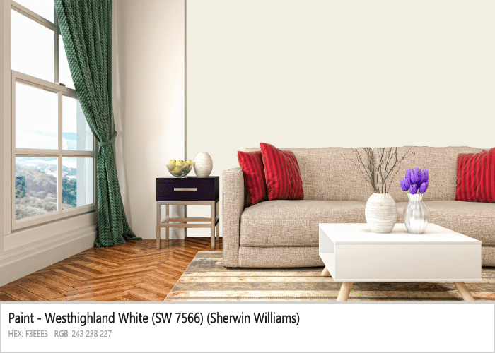
Have you also gone mad with your persistent and exhaustive hunt to look for a perfect ‘off-white’ paint but are unable to get to a consensus? End your search here with Westhighland White. This magical color by Sherwin Williams, from an off-white family, possesses the potential to transform your space into an epitome of elegance and purity.
The color is versatile and ‘evergreen,’ coordinating with almost every shade. This true off-white hue imparts a perfect balance between warm and neutral tones, making it a good choice for both warm and cool schemes. Ever imagined a creamy and soft hue, bringing warmth to your space while creating an immaculate atmosphere? This is what Sherwin Williams Westhighland White does to your space.
Want to leave a lasting impression on everyone who enters your space? Carry along with us to explore westhighland to its full potential.
Is SW 7566 Creamy?
Not in a true sense, but yes, it has a pinch of it. However, if you think it will have a yellow undertone, It’s a big ‘NO.’ Westhighland is a perfect all-purpose off-white color for your wall finishes, trims, and kitchen cabinets. It has a creamy touch, like a subtle primer, providing warmth and making your space look pristine and clean.
Hold on! If there is a touch of cream color, it signifies that it’s nearly white. Now with a whopping selection of more than 15000 white shades, it might seem overwhelming to identify and select the actual Westhighland white. But fear not; we’ve got you covered. The answer to all your related queries is mentioned in the below section.
About Westhighland White Sherwin Williams
Every paint color has some specific value, like LRV, RGB, and Hex codes. This separates and helps in the identification of each hue. New to these terms? Don’t worry, we’ll tell you alongside.
Westhighland has an LRV value of 86. LRV, better known as light reflectance value, tells about the amount of light reflected or absorbed from a paint.
Note: More the LRV is, the more light-colored the paint will be. Pure White has LRV 100.
Where do you get these LRVs? For SW paint, it’s on the back of the fan deck or the back of color chips. Next comes the RGB value, which signifies the proportions of red, green, and blue to make any specific color.
Lastly, the Hexcode of Westhighland White Sherwin Williams is #f3ee3. Hope now it’s easy for you to identify westhighland. But aren’t there any colors that look similar to it? It’s almost neutral, so every shade of white will look alike. Why this? Because alternatives are always good, and having them back for any situation is a smart call that you must carry along. Presenting a definitive end to your quest here with some shades similar to the Westhighland
Similar Shades to Westhighland White Sherwin Williams
Well, there are many, but We have got some best one that visually deceives your eye. Remember that all these only look alike but differ in specifications and the factors that affect them, such as different light conditions. Let’s explore!
1. Whitetail SW 7103
An exact match with an LRV of 86. So why does westhighland exist? Because it differs in some aspects. Whitetail has yellowy-beige undertones, in contrast with the warm undertones of westhighland. Also, Whitetail belongs to the orange-white family. Westhighland White Sherwin Williams possesses some grayish effect, but the latter never looks such in any situation.
2. Greek Villa SW 7551
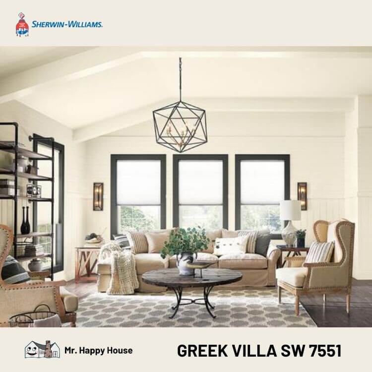
This color has an LRV of 84 compared to the previous color mentioned in the segment above i.e., 86, which clearly indicates its brighter inclination. Also, the villa has yellow-beige undertones, giving your space a warmer and more elegant look. At a glance, both look the same, but on a closer look, you will observe Greek is more beige.
3. Shell White SW 8917
Shell White and Westhighland vary with an LRV difference of 3. Owing to its yellow-beige undertones, it provides a more traditional look when compared. Also, both are warm white, but Westhighland looks more neutral, making it suitable for a wide range of design styles and color palettes.
4. Arcade White SW 7100
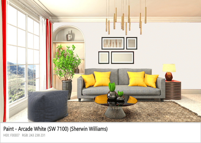
Arcade white is bright with a pinch of violet, making your space gentle and delightful. At the same time, westhighland makes your space look clean, warm, and cozy. As you can see, it’s tough to differentiate between the two at a glance. But on close observations, you can point out the violet effect in arcade white. Also, westhighland is on a more neutral side.
5. Paperwhite SW 7105
Paperwhite has cooler undertones and leans more towards a neutral grayish tone. In contrast, westhighland has a warmer undertone, creating a soft and serene atmosphere. But when exposed to light, the paperwhite, grayish undertone seems to have vanished, giving it a soft white look, just as white paint roller glides effortlessly over the surface.
We mentioned Westhighland White Sherwin Williams’s creamy look, emphasizing it’s not because of the yellow undertone. So what undertone does it possess?
The Undertone of SW Westhighland White
It possesses a warm undertone, responsible for its creamy look. Also, when on exterior walls, it exhibits more warmth, mainly because of lighting. But how does it feel when used on interior walls?
This classic neutral creates an ambiance that radiates warmth, making your room spacious, cozy, and inviting. Also, the hue has a transformative effect that adds air quality to your space, making it feel more open & expansive.
Further, the light and clean finish bring a sense of freshness and breathe new life into your space. It truly gives your room a new look that feels warmer, larger, and more vibrant. Moving on, you might think, ‘Does it not change its hue a bit ever?’ with factors like light? Let’s explore!
What Impact Does Light Have on Color?
Light doesn’t leave a significant impact on Westhighland White Sherwin Williams, but it does have a role in bringing out the effects of undertones. This is a concerning part. Why?
Because the hue exhibits a different appearance when exposed to other lighting conditions, like in a north-facing room or cooler light, it has an entirely neutral appearance, and undertones remain hidden. In contrast, westhighland white is warm and creamy when used in a south-facing room or rooms where warmer light falls.
So what’s best? It depends on your taste. But if you genuinely want to enjoy this off-white, using it in a room with little or cool light is better. Apart if you want a more inviting look, utilize warm colors. Now that you have decided on lights, how can you give westhighland a more infatuated look? The secret ingredient to this is “pairing with best-coordinating color,” much like adding paint additives to enhance its allure.
Best Paint Options to Coordinate with Westhighland White
If you are someone who lacks color sense, this could be an intimidating task. But if you’re good enough, playing around can yield excellent outcomes. Westhighland White Sherwin Williams is versatile and amazes you with each combination you make.
Just be careful and make coordination keeping in mind the kind of environment you want for your room. We got some best pickups that ooze different vibes. Seek out the below; it may match your taste!
1. Dorian Gray SW 7017
Dorian Gray is a rich, medium-toned gray with warm undertones, while westhighland provides creamy white color look with cool undertones. It adds depth and sophistication to a space, suitable for a more contemporary look. On the other hand, westhighland provides a fresh and bright appearance, providing a classic atmosphere in a room.
2. Eider White SW 7014
It is a soft, off-white color with warmer undertones and a pinch of light purple, while Westhighland is a cooler shade. Eider creates a cozy and inviting atmosphere in a room and coordinates well with warm color schemes, like a careful application of painter’s tape, defining and accentuating the space. While westhighland provides a fresh and clean look, making it suitable for creating a modern and minimalist look.
3. Enigma SW 6018
Enigma is a deep gray color with hints of blue and purple undertones. It creates a vibrant and dramatic appearance in space. In contrast, westhighland is a cool neutral shade of white that makes a pristine clean look, ideal for an airy and modern home. Both offer a striking and balanced combination, adding depth and sophistication to any room.
4. Tradewind SW 6218
A medium-toned grayish-blue color with a pinch of green undertone that evokes calmness and serenity. Westhighland white rests more on a creamier white side. It looks more organized and tidy, creating a fresh and modern atmosphere. Coordinating pairs can make spaces aesthetic, but it will lose all its charm if it isn’t in the right place. So what can make things right? Using the pairs at the right place where it’s prominent.
Ideal Settings for Westhighland White
Surprisingly, Westhighland White Sherwin Williams works excellently in all kinds of spaces. All you need is careful consideration of the light and coordinating pair. Imagining how westhighland will look in your living, dining or any other room? We got your back.
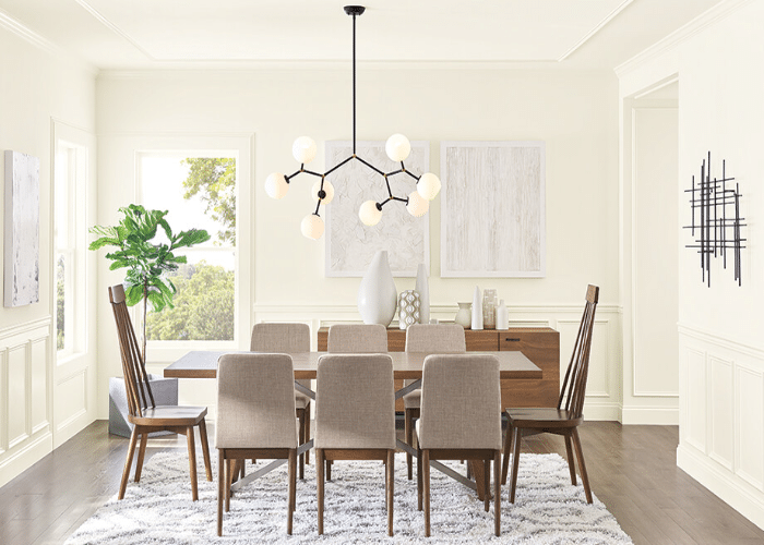
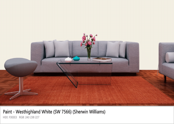
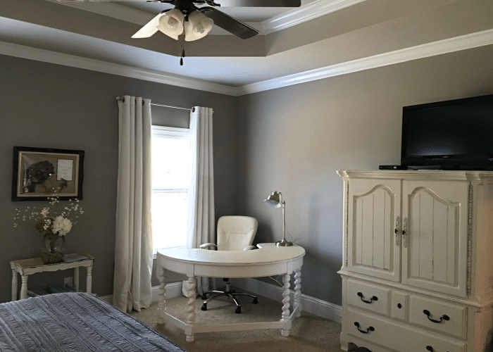
1. Living Room
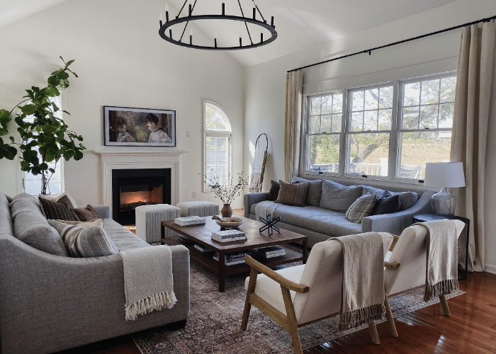
It is a perfect choice for a living room, making it look spacious, airy, and full of warmth. Also, it senses a feeling of comfort that soothes your mind and lets you enjoy and chit-chat freely. Look at the picture above; isn’t it great? It strikes a perfect balance of cleanliness, elegance, and finishing.
Tip: Use a paint sprayer to provide a better smooth and refined look to wall finishes.
2. Dining Room
The hue neutral tone with a greyish effect will make you fall for it in a dining room. Also, its cleanliness, silent and calming nature will soothe your mind, letting you enjoy your food. The color brings a sense of elegance and serenity to your dining space, creating an inviting and enjoyable atmosphere.
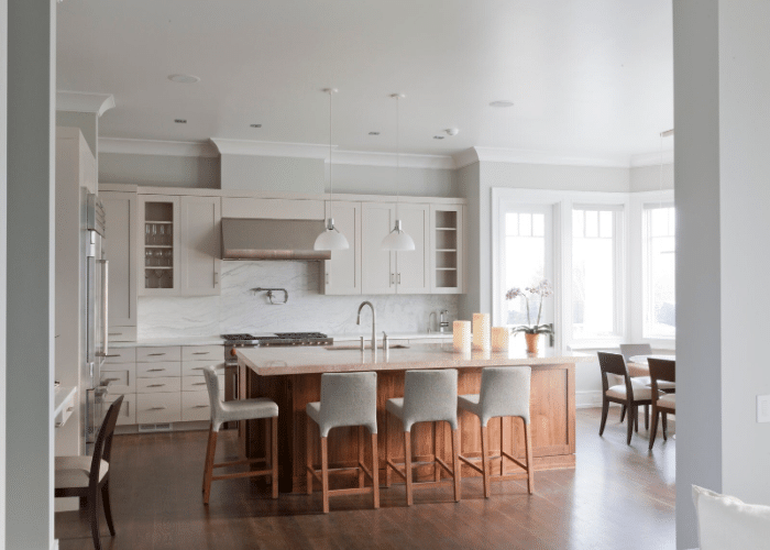
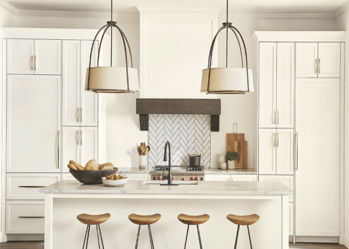
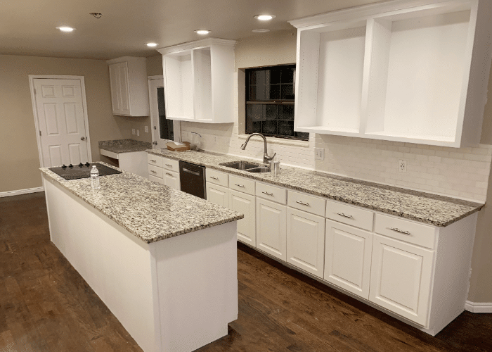
3. Kitchen
For someone who thinks cooking is a tedious task. The hue will heal their mind of stress, providing calmness. And for those who love cooking, the hue is going to create a jolly atmosphere. So it’s a win-win for both, as the soothing color palette turns the kitchen into a haven, making cooking a delightful journey.
4. Bathroom
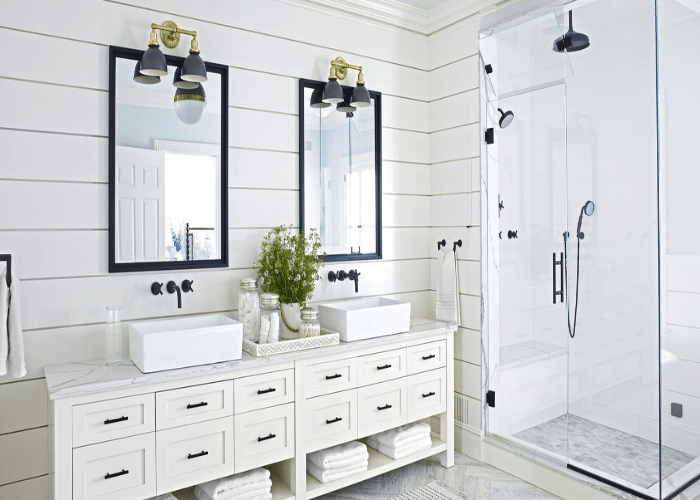
It gives your bathroom a luxurious look and creates a relaxing atmosphere. The soothing ambiance can calm the mind from the stresses of life, promoting a sense of rejuvenation and well-being. Further, the carefully chosen decor elements elevate the overall feel of your bathroom.
5. Cabinets
It’s an excellent choice to opt for your in-house cabinets. Its neutral tone exhibits a perfect sense of unity to be maintained throughout your westhighland wall finishes. Also, the finish of westhighland is too good, making cabinets look smooth and organized, much like a clear coat paint provides.
Thinking of giving different colors to your walls? Choosing bold ones with less contrast is a go-to choice. It will add vibrancy to your space and make it look exciting without too much visual tension.
Looks like it’s enough for the interiors. But what about the exterior? Is SW Westhighland white a good finish for your exterior walls? Let’s decide!
Does Westhighland White Look Good on Exteriors?

Absolutely ‘YES.’ Westhighland White strikes a perfect balance between a warm and neutral tone. This makes it look warm during the daytime, and at night, its neutral tone leads to a bright white color that looks classy.
Also, while on the exterior, it makes your home look more inviting because of the clean and organized appearance. It possesses a timeless appeal that suits both traditional and modern tastes.
Moreover, the hue tends to have practical advantages. The neutral tone reflects sunlight, keeping the interior of your home cool during the hot summer months. It also provides a sense of spaciousness, making rooms appear large and airy.
Conclusion
Westhighland White Sherwin Williams is the solution for your ‘off-white’ search. The versatile, clean, organized shade can make spaces look lively, elegant, and pure. Also, its balanced warm and neutral tones make it suitable for warm and cool color schemes.
It surpasses similar-looking tones in terms of smoothness and providing a more cohesive look. Further, the warm undertones make it a perfect choice for trims and cabinets as well. Coordinating it with different complementary colors with the right room selection can help utilize it to its full potential.
Wrapping up, it is a timeless choice that brings elegance and vibrancy to any space.
Frequently Asked Questions
Which Color is Less Neutral than Westhighland?
A less neutral color will be Sherwin William Alabaster, with an LRV of 82. It has a slightly warmer undertone compared to Westhighland, making it less neutral in appearance. It will be a good choice for those looking for a soft off-white color that maintains warmth in space.
Does ‘SW Westhighland’ White Pair off Well with the Earthy Tones?
Of course, ‘yes,’ it goes well with earthy tones. An earthy, bold color with a perfect contrast will work wonders, creating a harmonious and inviting atmosphere. Further pairing with earthy tones helps achieve a natural and ground look that creates a soothing ambiance throughout your space.
