
Have you ever seen a wall color change as the day goes on? Sherwin-Williams’ Labradorite (SW 7619) does just that. This special blue-gray shade acts like the stone it’s named after, showing new sides with each passing hour. Try samples on multiple walls to see how the tone changes from morning to night.
Most blues stay the same all day. Plain grays often lack life. But Labradorite brings something different to your home. It looks clean and calm in the morning, rich and full by lunch time, and warm and snug when evening comes. It sits right in the middle – not too bright, not too quiet.
Home experts often choose Labradorite when people want rooms that feel both classic and fresh at the same time. This color works in any room, with any style, and helps make your space feel planned and put-together.
Want walls that catch the eye without trying too hard? Labradorite might be just what you’re looking for.
Sherwin-Williams Labradorite Overview
Labradorite is a sophisticated, complex paint color that captures the essence of its namesake gemstone. It presents as a versatile blue-gray with subtle depth that shifts its appearance throughout the day as lighting changes. For interior painting projects, it adapts easily in living areas, bedrooms, and work nooks.
The color evokes the tranquil feeling of coastal fog or twilight skies, making it an excellent choice for creating serene, contemplative spaces. It also translates well outdoors for exterior painting on trim or entry doors.
Its balanced undertones allow it to pair beautifully with both warm and cool accents, from natural woods to crisp whites. Neither too bold nor too recessive, Labradorite offers a timeless elegance that works well in modern, transitional, and classic design schemes. Use this balance to craft a cohesive color scheme across adjoining rooms.
| Attribute | Details |
|---|---|
| Color Name | Labradorite |
| SW Color Code | SW 7619 |
| Location Number | 281-C7 |
| LRV (Light Reflectance Value) | 19 |
| RGB Values | 101 / 123 / 131 |
| Hex Value | #657B83 |
| Color Family | Blue |
| Color Collections | Timeless Colors |
| Available In | Interior/Exterior |
| Description | A versatile medium-dark blue-gray with subtle depth that works well in various lighting conditions |
Psychological Impact of Deep Blue Tones
Deep blue tones like Labradorite tap into our primal connection with water and sky, creating spaces that naturally encourage reflection and contemplation. These hues have been shown to lower blood pressure and heart rate, making them particularly effective in environments where stress reduction is desired. Blue tones are known to:
- Promote mental clarity and focus
- Enhance productivity in intellectual tasks
- Create a sense of order and calmness
- Slow down perception of time, encouraging mindfulness
- Facilitate better communication and honesty
How Labradorite Evokes Calm, Confidence, and Depth
Labradorite occupies a unique space in the color spectrum, balancing the tranquility of blue with the sophisticated neutrality of gray. This combination creates a multifaceted psychological effect:
Calm: The blue undertones in Labradorite create an immediate sense of peace and serenity, making it ideal for spaces where relaxation is paramount. Unlike brighter blues that can sometimes feel chilly, Labradorite’s muted quality offers warmth within its coolness.
Confidence: There’s an inherent authority in Labradorite’s depth. This is not a timid color—it makes a statement without shouting. Spaces painted in this hue convey a quiet confidence and established presence, perfect for professional environments or areas where important decisions are made.
Depth: Like its gemstone namesake, Labradorite paint has a remarkable dimensional quality. It seems to recede slightly, creating the optical illusion of more space while simultaneously adding richness to a room. This depth invites contemplation and creates visual interest even in minimalist settings.
Ideal for Those Who Love Sophistication with a Bit of Edge
Labradorite appeals to those with refined tastes who aren’t afraid of complexity. It’s perfect for:
- The design-conscious professional who wants a home that feels both elegant and comfortable
- Creative thinkers who appreciate nuance and subtlety
- Those who value timelessness over trends but still want something distinctive
- People who entertain frequently and want a sophisticated backdrop for social gatherings
- Anyone looking to create spaces that feel both grounding and aspirational
This color works exceptionally well for those who might find pure neutrals too safe but consider bold colors too overwhelming. Labradorite offers the perfect balance—sophisticated enough for formal spaces yet with enough character to create memorable, distinctive environments.
The Labradorite Canvas: Ideal Applications
Living Rooms: Cozy Sophistication
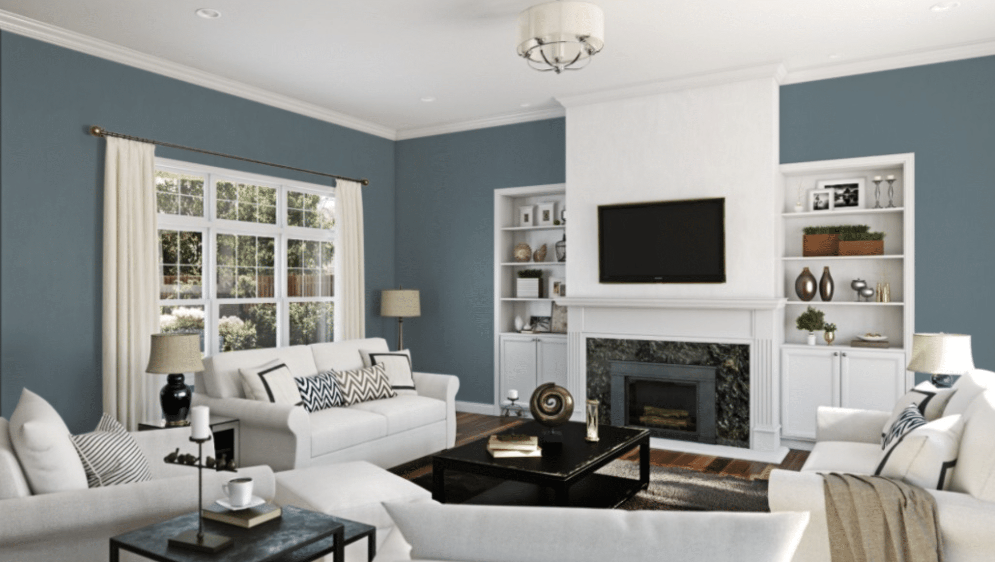
Labradorite transforms living spaces into elegant gathering areas without sacrificing comfort. This versatile blue-gray creates a perfect backdrop for both natural textiles and metallic accents.
It pairs beautifully with camel leather furniture, warm woods, and brass fixtures to create a space that feels both timeless and current. The color’s depth provides a sense of enclosure that encourages conversation and connection, while its blue undertones maintain an airy quality that prevents the room from feeling too dark or heavy.
Bedrooms: Deep, Serene Retreat
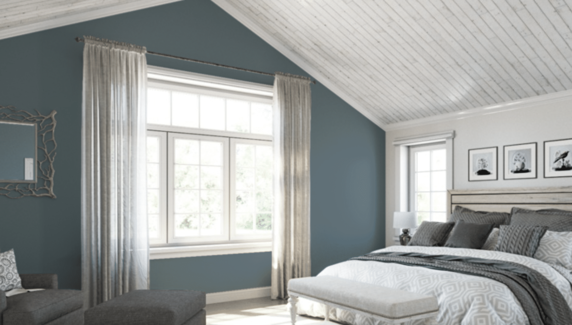
In bedrooms, Labradorite excels at creating a cocoon-like atmosphere conducive to rest and relaxation. The color naturally recedes, making even smaller bedrooms feel more spacious while still providing that crucial sense of sanctuary.
Its muted quality absorbs light rather than reflects it, reducing visual stimulation that can interfere with sleep. Layer with soft whites, natural linens, and minimal decor for a contemporary retreat, or pair with rich textiles and antique furnishings for a more traditional, enveloping sleep space.
Offices: Focused and Stylish
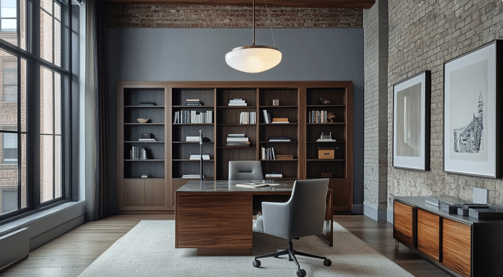
Productivity meets personality when Labradorite graces a home office or professional space. The color’s blue undertones promote concentration and clear thinking, while its sophisticated gray balance ensures the environment never feels cold or clinical.
This hue provides an excellent foundation for minimalist workspaces, allowing furniture and organizational elements to stand out clearly. The color’s depth also helps reduce eye strain during long work sessions, as it creates less contrast with digital screens than brighter wall colors.
Accent Walls or Cabinets: Adds Dimension
Not ready to commit to a fully Labradorite room? This color makes an exceptional accent when used selectively. As an accent wall, it creates a natural focal point without overwhelming the space, particularly effective behind shelving or artwork.
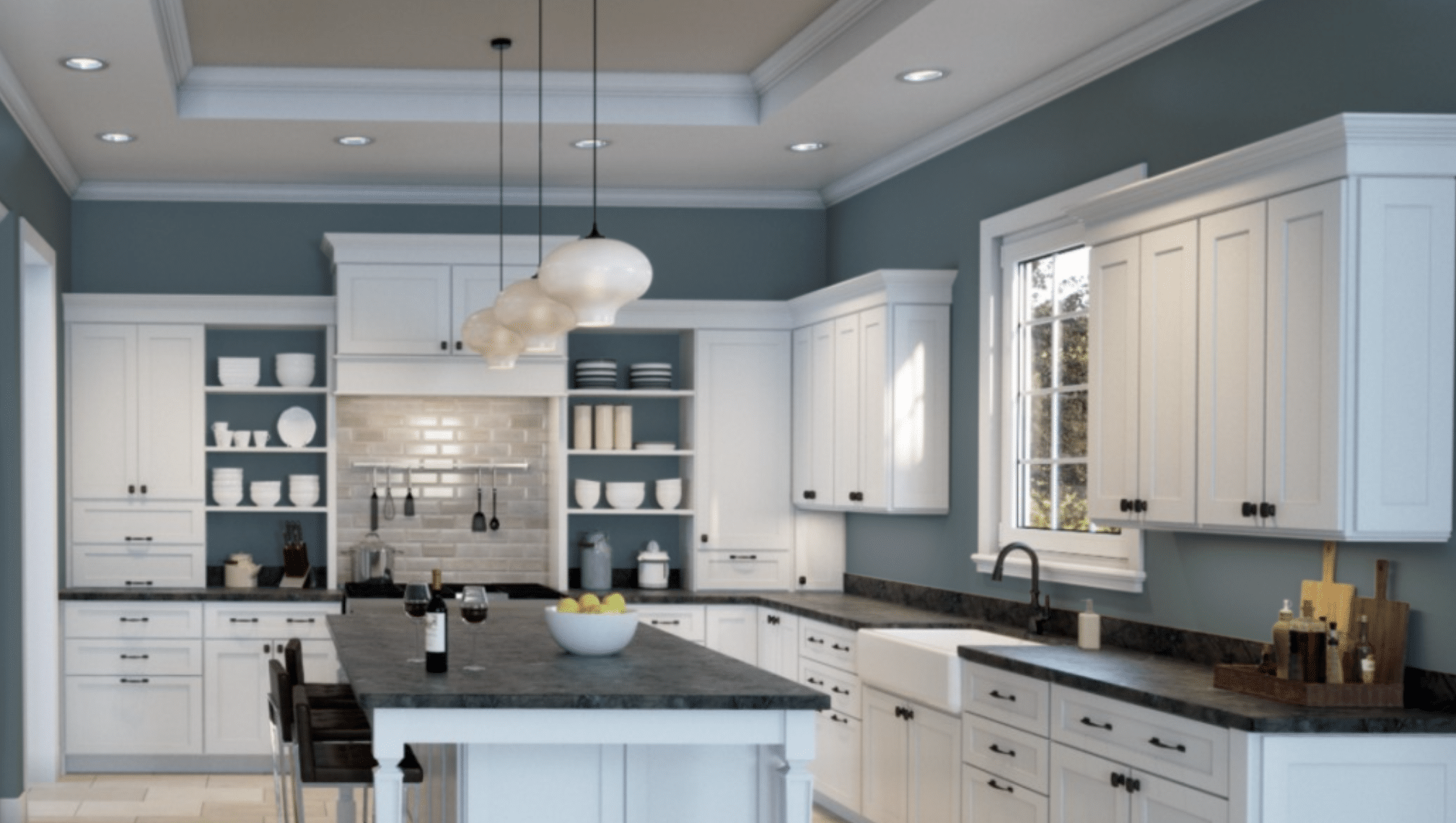
On kitchen or bathroom cabinets, Labradorite offers a refreshing alternative to white or wood tones, adding architectural interest while maintaining a clean, contemporary aesthetic. Its neutral qualities ensure it will coordinate with most countertop materials and fixtures, making it a versatile choice for partial applications.
What Colors Pair Well With Labradorite
Complementary Colors: Warm Neutrals and Soft Whites
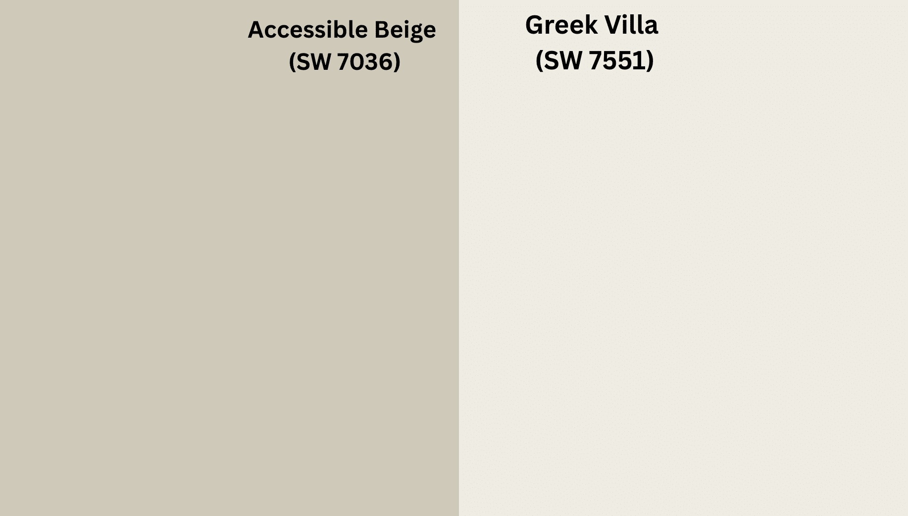
Labradorite’s complex blue-gray tone creates a sophisticated foundation that harmonizes beautifully with warm neutrals. Colors like Accessible Beige (SW 7036) and Agreeable Gray (SW 7029) enhance Labradorite’s depth without competing for attention. These pairings create spaces that feel balanced and timeless.
Metallic elements, particularly brass fixtures and accents, bring out the richness in Labradorite. The warm golden tones create a pleasing contrast against the cool undertones of the blue-gray, adding dimension and luxury to any space.
Soft whites like Alabaster (SW 7008) or Greek Villa (SW 7551) provide breathing room when paired with Labradorite. These whites have subtle warmth that prevents the combination from feeling stark or clinical, instead creating a refined, airy aesthetic that allows Labradorite’s complexity to shine.
Contrasts: Blush Pinks, Earthy Greens, Deep Wood Tones
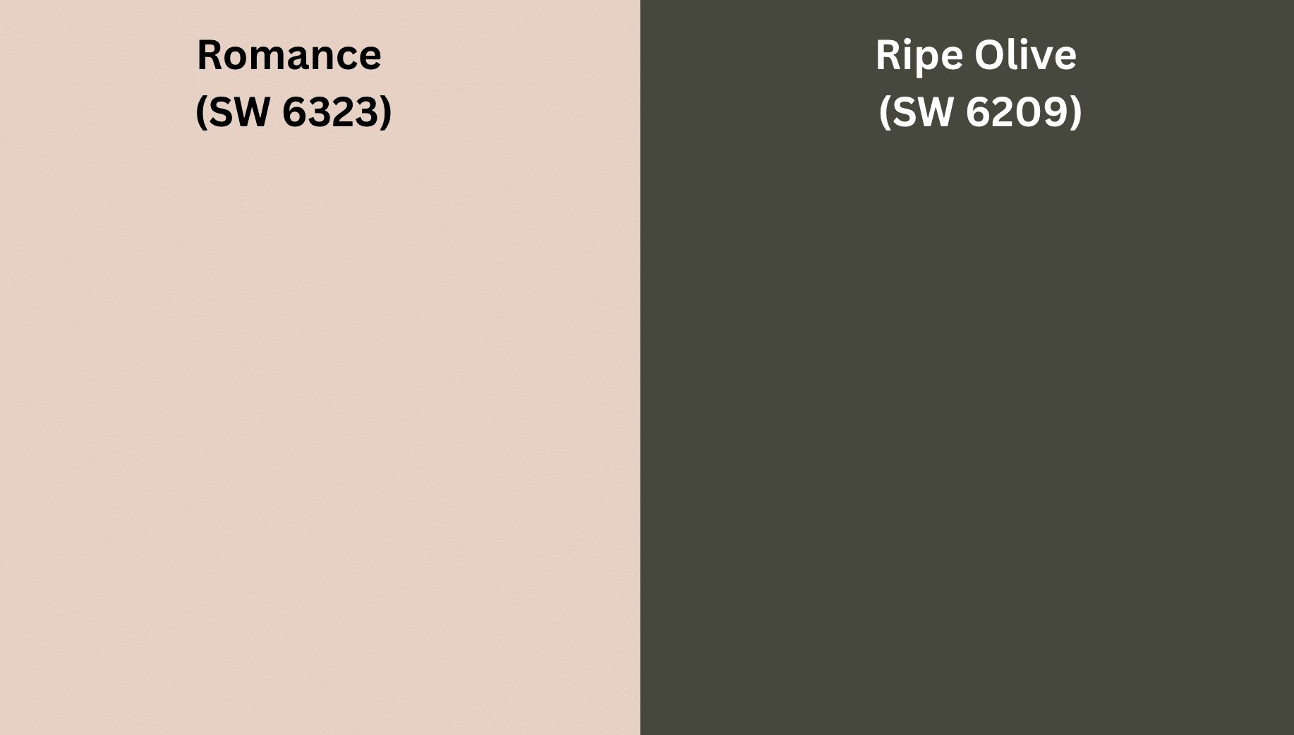
For those seeking more dynamic color relationships, Labradorite plays surprisingly well with subtle blush pinks. Intimate White (SW 6322) or Romance (SW 6323) creates an unexpected but harmonious pairing that feels both contemporary and inviting.
Earthy greens like Ripe Olive (SW 6209) or Rookwood Sash Green (SW 2810) complement Labradorite by emphasizing its cool undertones while adding organic warmth to the palette. This combination evokes natural landscapes and brings a grounded feeling to interiors.
Deep wood tones, especially walnut and mahogany finishes, create rich textural contrast with Labradorite. The natural warmth of these woods balances the coolness of the blue-gray, resulting in spaces that feel layered and thoughtfully designed.
Sherwin-Williams Suggestions for Palettes
Modern Minimalist Palette:
- Labradorite (SW 7619) – Main walls
- Extra White (SW 7006) – Trim and ceilings
- Urbane Bronze (SW 7048) – Accent elements
- Natural wood tones – Furniture and flooring
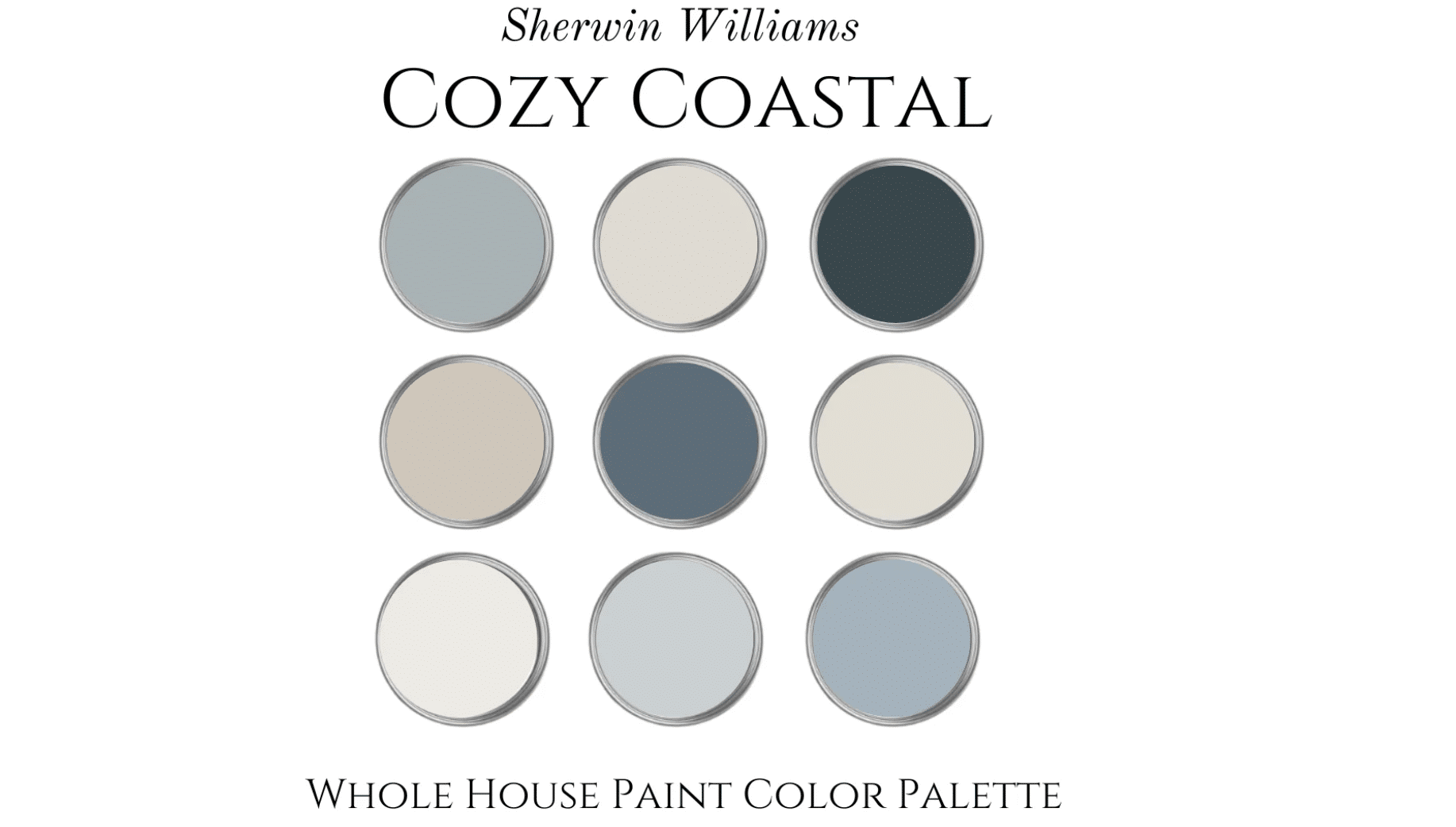
Coastal Sophisticated Palette:
- Labradorite (SW 7619) – Feature walls
- Sea Salt (SW 6204) – Secondary spaces
- Pure White (SW 7005) – Trim
- Indigo Batik (SW 7602) – Accent color
Transitional Classy Palette:
- Labradorite (SW 7619) – Main color
- Creamy (SW 7012) – Complementary walls
- Emerging Taupe (SW 6045) – Coordinating elements
- Tricorn Black (SW 6258) – Accent details
Conclusion
Sherwin-Williams’ Labradorite offers more than just a color—it’s a choice that adds depth to any room. This blue-gray shade works well in small reading corners or on kitchen cabinets, making spaces feel both steady and fresh.
Just like the stone it’s named after, Labradorite looks different as the sun moves across your home. The color shows new sides of itself from morning to night. Its mix of blue and gray tones helps it fit with many home styles and other colors.
Want a color that makes a gentle point instead of being too loud? Think about Labradorite for your walls. This lasting color sits right between plain beige and bright bold shades—good enough for fancy rooms but still showing your own taste.
In the end, rooms with Labradorite look well-planned rather than just filled with stuff. It’s a color that stays good-looking for years to come.